INSIDE AN UNCONVENTIONALLY GLAM FAMILY HOME IN CHICAGO’S HISTORIC PALMOLIVE BUILDING
Two design powerhouses join forces to craft a sophisticated city space for a newly-married couple and their five kids.
image
BY LUCIA TONELLI
APR 30, 2019
kadlec berkus chicago home tourTony Soluri
A world class art collection, high-gloss lacquered rooms, a walnut-clad lounge, located in Chicago's Palmolive Building—these are not the descriptors you’d expect for the home of a family of seven. But for two newly-weds—each with their own children in their 20s—the idea of “family living” did not include playrooms or kid-proofing. This would be a mature space for living, hosting, and most importantly, enjoying time together. The same way that two families would be merging into one, two designers—Steve Kadlec of Kadlec Architecture + Design and Sasha Adler (formerly the design director of Nate Berkus and Associates)—would be joining forces to transform two units into one full-floor residence in the historic Chicago building.
Kadlec, who had worked with the husband on a previous project, would be carrying out the architectural renovations, while Adler, who was commissioned by the wife, would be in charge of the interior design. “The design team became part of the blended family, the husband bringing in his architect and the wife, her interior designer,” Kadlec explains. A sort of high-glam Brady Bunch scenario, the collaborative process resulted in unsurprisingly cohesive interiors, and an impeccably designed home where, as Adler puts it, "they would like to put their feet up and their drinks down."
image
The formal dining room features statement artwork and a sculptural light fixture.
Tony Soluri
ADVERTISEMENT - CONTINUE READING BELOW
Having tested out several other locations in the city prior to discovering this listing, the design team decided it would be best to purchase and combine two apartments, transforming them into a full-floor residence. "The couple is vivacious, fun, and well-traveled, with a fantastic design sensibility and a real understanding and appreciation of natural materials, things crafted by hand, quality, and provenance,” Adler says. “They were looking to build a home and collection together that really reflected them.” With older children who were all past college, the space needed to be suitable for the couple on a daily basis, while accommodating to their children and extended family when they visited. The couple loves to entertain, so the home, despite its many rooms, would need to flow seamlessly and feel completely connected. “A well-organized, functional floor plan was the starting point,” Kadlec says.
luxury chicago home tour
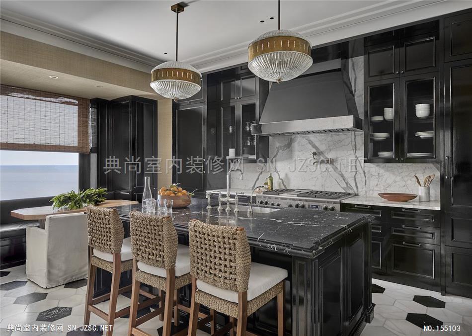
The kitchen is black lacquered with grass cloth walls, has two inset vintage brass vitrines, and showcases the home’s fine details through notched edges on the kitchen island countertop.
Tony Soluri
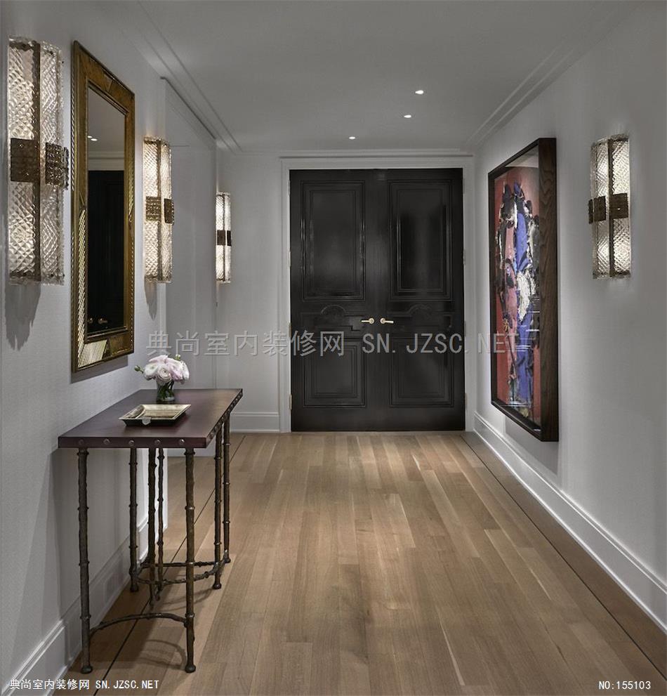
With the task of merging two units into one, finding an architectural rhythm was the first priority. “The renovation was more a delicate surgery rather than a gut-rehab,” says Adler. And the architecture needed to create a canvas for the interior design. Developing a language of materials, understanding the bandwidth for lighting and mechanical systems, and considering the finer details from the start, helped inform the architectural plans. “Sasha’s team understood the character of the architecture and its organization, so it was a collaborative process developing and refining millwork details, lighting layouts, and architectural finish direction,” Kadlec says. With access to the hallways and elevator lobby, he constructed a long central hallway to help organize the disparate elements of each apartment—a spine for the body of the sprawling home.
CLICK THROUGH FOR THE FULL CHICAGO HOME TOUR
Kadlec Architecture + Sasha Adler
在芝加哥历史悠久的棕榄大厦里,两家设计巨头联手为一对拥有五个孩子的新婚夫妇打造了一个精致的城市空间。两名设计师——steve Kadlec和Sasha Adler(前Nate Berkus and Associates的设计总监)——将联手把这幢历史悠久的芝加哥建筑的两个单元改造成一个单层住宅。
世界级的艺术收藏品,高光漆的房间,胡桃木覆盖的客厅,这些都不是你所期望的七口之家的描述。但对于这对20多岁的新婚夫妇来说,“家庭生活”的概念并不包括游戏室或儿童安全设施。这将是一个成熟的空间,供人们生活、招待,最重要的是,可以享受在一起的时光。
Adler说:“这对夫妇活泼、有趣、游历甚广,对设计有着惊人的敏感性,对自然材料、手工制作的物品、质量和出处有着真正的理解和欣赏。”“他们想要建立一个家,并一起收集真正反映他们的东西。Kadlec说:“一个组织良好、功能齐全的楼层平面图是一个起点。”
厨房是用草布墙漆成的黑色,有两个嵌套的老式黄铜玻璃橱窗,并通过厨房岛台上的缺口边缘展示了住宅的细节。Kadlec说:“Sasha的团队理解了建筑的特点和组织结构,所以这是一个协作的过程,开发和细化木制品的细节、灯光布局和建筑的完成方向。
Inside an unconventionally glam family home in Chicago's historic palmolive building, Two design powerhouses join forces to craft a sophisticated city space for a newly-married couple and their five kids.Two designers—Steve Kadlec of Kadlec Architecture + Design and Sasha Adler (formerly the design director of Nate Berkus and Associates)—would be joining forces to transform two units into one full-floor residence in the historic Chicago building. A world class art collection, high-gloss lacquered rooms, a walnut-clad lounge,these are not the descriptors you’d expect for the home of a family of seven. But for two newly-weds—each with their own children in their 20s—the idea of “family living” did not include playrooms or kid-proofing. This would be a mature space for living, hosting, and most importantly, enjoying time together. "The couple is vivacious, fun, and well-traveled, with a fantastic design sensibility and a real understanding and appreciation of natural materials, things crafted by hand, quality, and provenance,” Adler says. “They were looking to build a home and collection together that really reflected them.”“A well-organized, functional floor plan was the starting point,” Kadlec says. The kitchen is black lacquered with grass cloth walls, has two inset vintage brass vitrines, and showcases the home’s fine details through notched edges on the kitchen island countertop.“Sasha’s team understood the character of the architecture and its organization, so it was a collaborative process developing and refining millwork details, lighting layouts, and architectural finish direction,” Kadlec says.
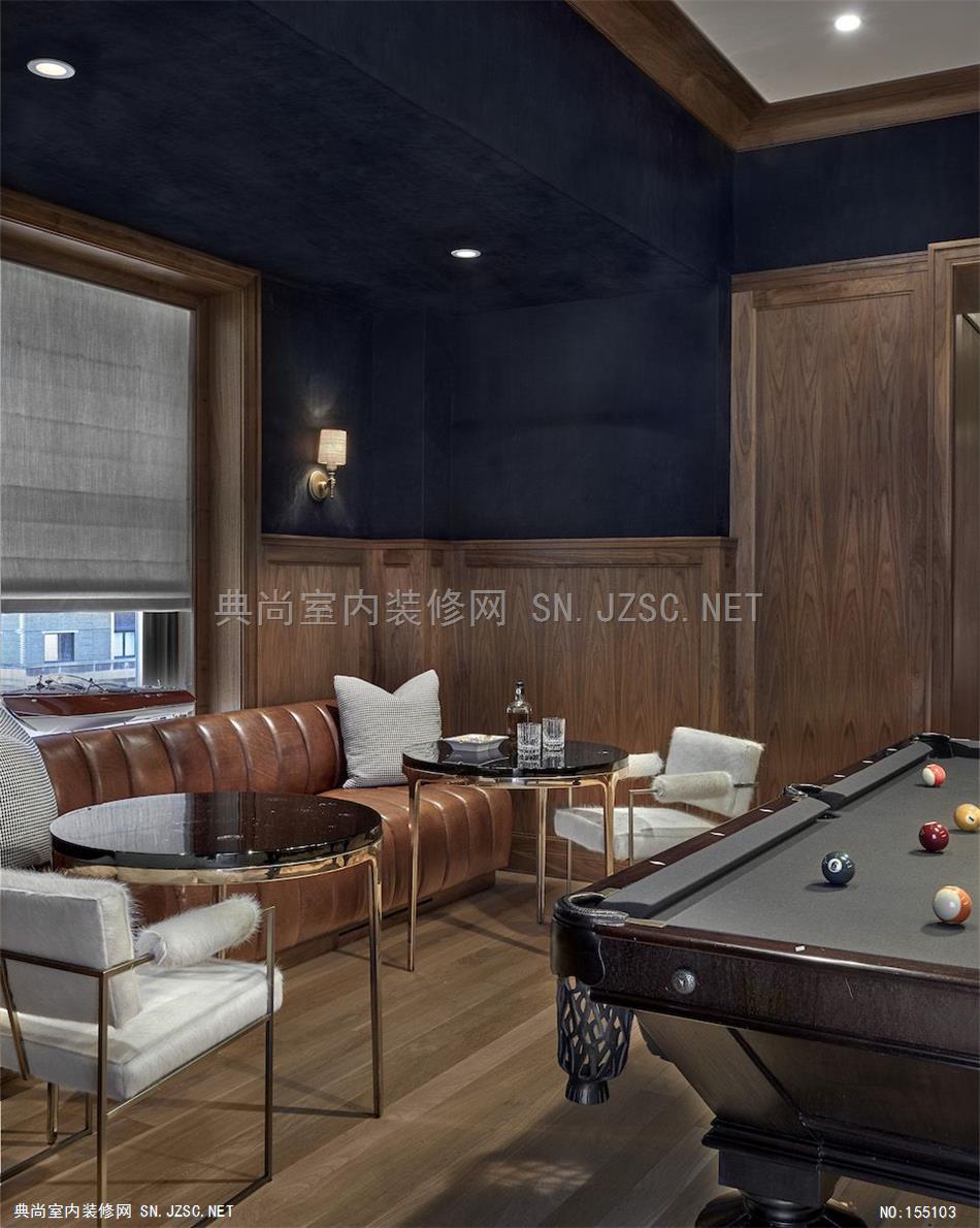
The billiard's room was inspired by the RL Bar in Chicago.Tony Soluri
ADVERTISEMENT - CONTINUE READING BELOW
Before grabbing any paint cans or sourcing new furniture, Adler took time to get to know her clients, how they lived, and what they were looking to achieve—an unrushed approach that was made possible by extensive, time-consuming renovations. “Ultimately, the goal was to create a space that was refined, comfortable, thoughtful, and flexible because sometimes there would be two people living in the home, and sometimes there would be 10,” Adler says. The living, dining, family room, office, kitchen, and bar—which are all located on one side of the apartment—are connected through the home’s central rotunda. Details including brass inlay in the natural oak herringbone floors, which run the length of the hallway, signify another important marker in creating a natural flow. The other side of the apartment serves as the entertainment hub, with a walnut-and-suede paneled billiards room and bar, high-gloss lacquered office, and great room.
luxury chicago home tour
The billiard’s room, which was inspired by the RL Bar in Chicago, has paper-backed navy suede on the walls, walnut paneling, and a zinc bar.
Tony Soluri
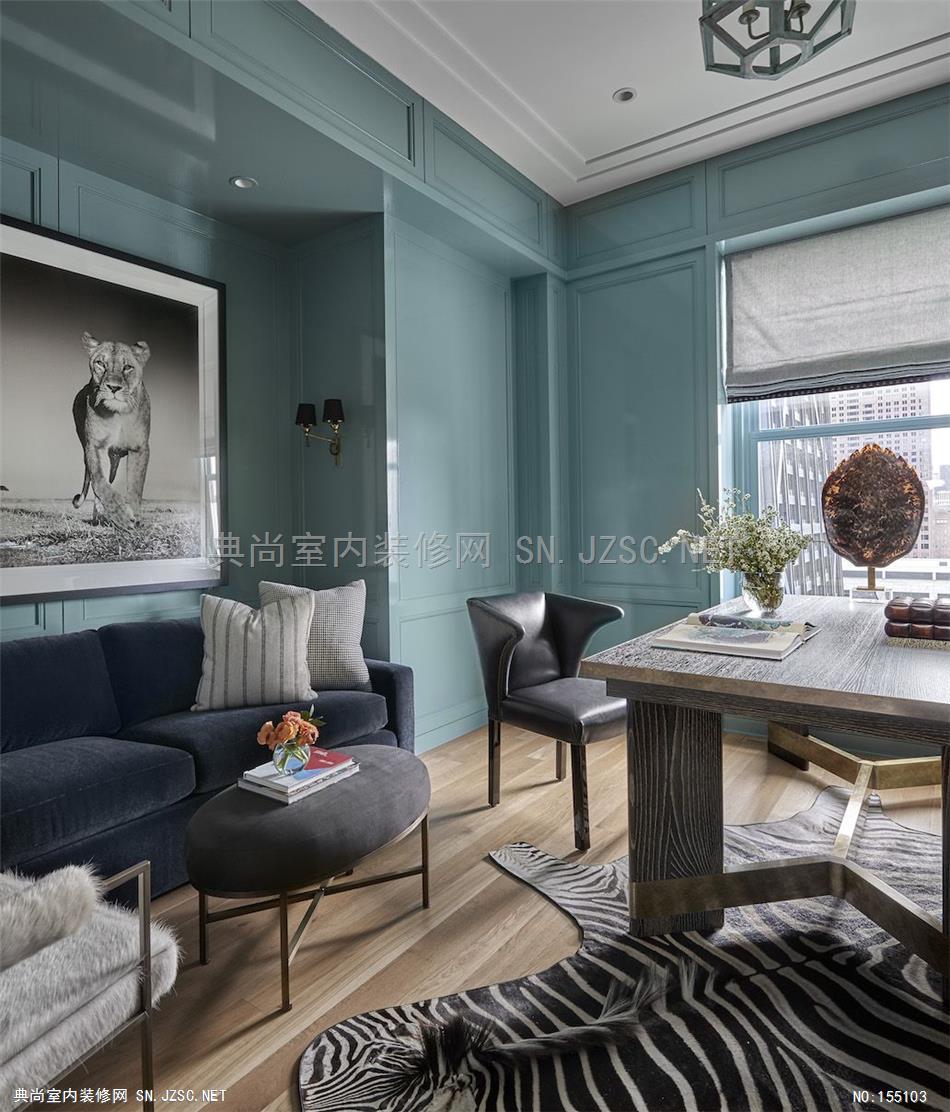
Despite the home’s modern and clean-lined sensibility, color was used to highlight specific details and give the rooms each a unique identity. Even given the bold choices—black lacquered kitchen, French Blue lacquered office—the spaces feel seamless and comfortable, dodging the harshness of colors too bold or too intense. “We’d go through dozens of samples to get the perfect shade!” Adler says. And with these star pieces in the home, there needed to be a proper supporting cast. Textiles, specialty paint finishes, and wall coverings are just some of the ways in which Adler struck a balance with the bold pops. While the architecture pushes for spatial flow, the interior design pulls back with visual structure.
luxury chicago home tour
The office is lacquered in a stunning French Blue (they went through nearly 12 samples and various paint manufacturers to get that shade to the perfect hue).
Tony Soluri
Just as design aesthetics require a strong sense of balance, so do the minds of those behind it all. “There were no egos on the team, which allowed for an open exchange of ideas, with the simple goal of making the project the best it could be for the client,” Kadlec says.
