Making the Everyday Ever After
Background & Brief
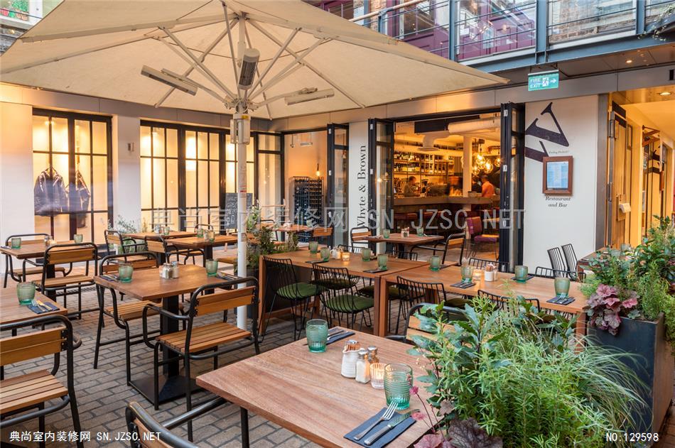
Overseen by Chairman Kevin Bacon and Creative Director Fiona Gale, Whyte & Brown is a brand new restaurant concept. Currently situated in the heart of London’s buzzing Carnaby Street, this is the first of what is hoped will be many sites for the brand. Creative Director, Fiona Gale approached Blacksheep two years ago with her vision for Whyte & Brown. She recognised a gap in the market for restaurants offering free-range chicken dishes and took this opportunity to develop the concept. One of her key design directions was that Whyte & Brown should have a hint towards an industrial and reclaimed style but softened around the edges.
Our Solution
Blacksheep translated this direction so that it underpinned the interior design of the whole restaurant whilst giving it a feminine twist, to ensure it would also be comfortable, honest and colourful.
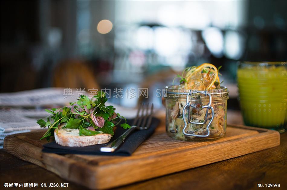
As the concept developed, the brand DNA of ‘human alchemy’ evolved. The concept meant the raw materials used within the design would have a human touch in some way. The food at Whyte & Brown also reflects this by taking everyday ingredients and transforming them into amazing dishes, creating partnerships that make the 'everyday ever after'.
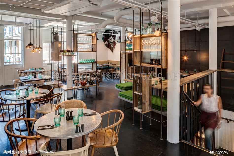
A range of key design features combine and merge to bring this vision to life. The use of raw industrial materials throughout the restaurant contrast with the colour and softness of upholstered items, reinforcing the play between hard and soft. Beautiful thickly upholstered mattress style seat cushions, individual bespoke designed free-standing sofas and floral backed feature upholstered armchairs, all combine to add extra comfort for guests, making it a home away from home. Elements of the traditional home kitchen are also apparent throughout the restaurant including a butler sink with exposed pipework and taps for filling diners' drinking water.
A series of smaller room settings have also been created within the larger space of the restaurant. This was implemented through the use of reinforcement bars and scaffolding planks, raw items typically used in construction, to create shelving and storage which connect to waiters stations and individual seats whilst also forming table arrangements for its guests.A marble group chef’s table also extends out from the kitchen to create that all important connection between the kitchen and dining space and gives the guest an insight into the cooking process reinforcing the honesty of the brand and the concept it promotes.
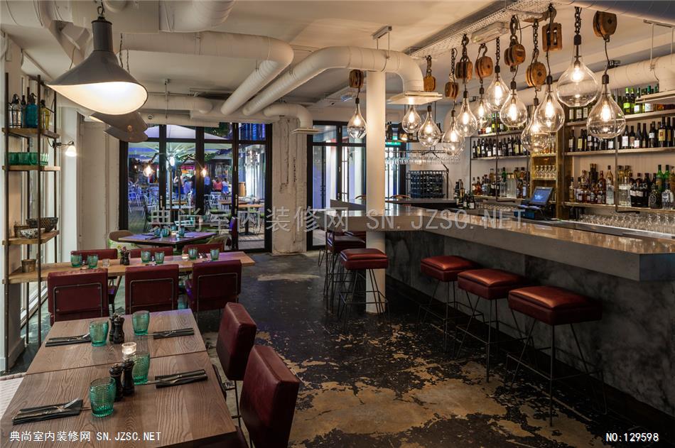
A number of other important design elements were also used to bring an atmosphere of theatre and drama to the venue such as a large polished concrete bar which connects to form the 7th step of the restaurant’s staircase. In effect, the guest steps up onto the bar counter as they ascend. A mirror suspended over a large communal polished concrete sink trough in the restaurant’s W/Cs, with exposed pipes and taps fixed at the front provides a dark and melancholy atmosphere which starkly contrasts with the bright and airy feel of the restaurant, giving the guest something unexpected to enjoy.


