





设计说明
鉴于项目的商业需求,藉以本源品牌之文脉作为开宗明义之宗旨。传承与提升延伸出内心触感。时光难以捉摸,却真切发生着,若以齿轮作为时间运行的参照,轮齿推进牵连相应结果,可以预料,景物虽不可避免因时光累积而渐生老态,但却也因此相生韵致,营造值得细味的故事内涵。在本案,设计师转动时空罗盘,思考空间,时间的运动性,并且展现一个大胆的想象空间。
在营造一间专业意大利陶瓷展陈空间设计伊始,基地属于一栋原属街边店面,充分了解有关销售动作的需求,设计师将三层空间的逻辑梳理出更为适用之流程,将首层作为项目的调性奠定与品牌传臻,将电力升降梯作为上升垂直空间的前端交通,空间维度发乎雕塑性来推演机能与美感,带来更为周全与尽美的体验式参观之旅…
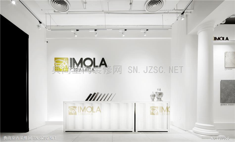
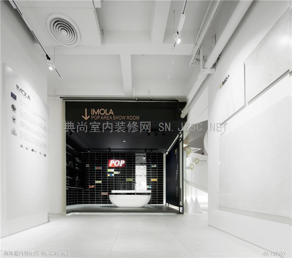
正对入口,映入眼帘的是具有百余年发展史的意大利IMOLA瓷砖做序列处理作为接待台的背景,以及罗马柱的设计更是凸显这一主题。设计师凭借着对工作的执着,对美的追求和不断的创新意识,缔造出“IMOLA”这一特色的展陈空间,以及进行历史的品牌文化的阐述。“享受美好人居,享受幸福生活”是IMOLA先进设计理念与制造工艺的代表,随着体验式参观之旅的行进,进门右转,你将看到将近十米高的条幅贯穿IMOLA整个三层,将IMOLA的字母进行夸大的手法,犹如一尊雕塑,屹立在以纯净洁白的IMOAL瓷砖做背景的展厅中,打通三层空间,顶面与地面相呼应。
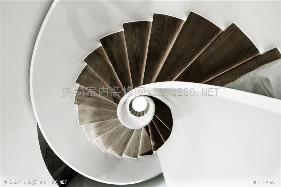
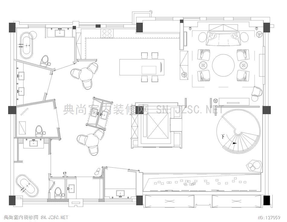
唯美至极的流体旋转楼梯作为回流美学的交通核心,基于人们对于线性的理解,横线为平衡,竖线为挺拔,斜线为动态,弧线为柔和,楼梯自身独特的斜体线形和弧线的姿态结合起来,集中体现在圆弧旋转楼梯之中,会使静态的空间变成活泼的动态环境。
空间设计师充分了解空间的流线,将二楼主要设置为办公区和洽谈区,整体偏暗调的二层空间,悬挂着壁炉点亮着空间细节,整个设计静谧柔和,设计师更是注重细节的处理,从字体的选择到整个墙面瓷砖的铺设,无不体现设计师的用心。
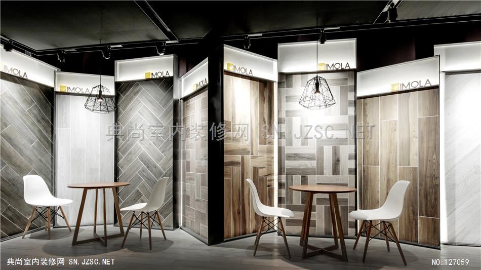
作为主要的瓷砖展厅的展示空间,三层整个空间设计中,设计师主要采用集装箱container的理念,意指原装进口,漂洋过海之意。通过强烈的黑白对比,更是在造型上采用非常规造型,每一隔间以不同系列的瓷砖为主题,进行空间设计,同时呼应主题的集装箱的理念更是无处不在,设计师充分理解IMOLA瓷砖的审美品位,创造精致,优雅,艺术性的展厅空间。满足现代人汲汲营营的脚步中所追求的精神与物质的平衡,艺术与历史共存,静谧间有如永恒。
In view of the business need for the project, as the origin of the brand to the context of purpose. Heritage and enhance the extension of the inner touch. Time is elusive, but truly happen, if the time running gear as a reference, to promote the tooth can be expected, the corresponding results implicated, scenery is inevitable because of the time accumulated gradually born old, but also create the taste is worth and charm, the connotation of the story. In this case, the designer turns the space compass, thinking space, time movement, and show a bold imagination.
To create a professional Italy ceramics exhibition space design at the beginning of Chen, a storefront formerly belonging to the base, to fully understand the relevant sales action needs, the designer will sort out the logic of three layer space more suitable as the project process, will be the first layer of tonality lay with the brand Zhen, front end of the elevator as traffic power the rise of vertical space, space dimension from sculpture to deduce the function and aesthetic feeling, bring a more comprehensive visit and experience of perfect trip...
Opposite the entrance, was greeted with a hundred years of history of the development of the Italy IMOLA tiles do sequence processing as the reception background, and the design of Rome column is to highlight the theme. Designers rely on the dedication of the work, the pursuit of beauty and continuous innovation awareness, to create a "IMOLA" this characteristic exhibition Chen space, as well as the history of the brand culture. "Enjoy a good living, enjoying a happy life" is the representative of IMOLA advanced design and manufacturing process, with the experiential tour of the road, turn right, you will see a nearly ten meter high throughout the entire three banners IMOLA layer, IMOLA characters in an exaggerated way, like a statue, standing in a pure white IMOAL tile background of exhibition hall, through three layers of space, the top surface and the ground echoes.
Beautiful extremely fluid rotary stairs as reflux aesthetics traffic core, based on the understanding of the people for the linear, line balance, vertical line is straight, diagonal dynamic arc, soft staircase unique shape and italic arc attitude together, embodied in the circular staircase, will make the static space into dynamic lively environment.
Designers to fully understand the space streamline, two floor of the main setting for the office area and business district, the two layer space overall partial darkened, hanging fireplace lit space in detail, the design is more quiet and soft, designers pay attention to detail, from the choice of the font to laying the whole wall tiles, all reflect the designer the heart.
As the main tile exhibition space, the three layer of the whole space design, designers are using the concept of container, which imported from abroad. The strong black and white contrast, more is the use of non conventional modeling in the modeling, each compartment with different series of tiles as the theme of space design, also echoed the theme of the container concept is ubiquitous, designers fully understand IMOLA tile aesthetic taste, create exquisite, elegant, artistic exhibition space. Satisfy the material and spiritual pursuit of modern people's footsteps connive the balance of art and history of coexistence, quiet is eternal.
项目名称:意大利IMOLA 陶瓷展厅
设计地点:江苏省江阴市
设计单位:无锡市未视加空间设计有限公司
设计主案:孙传进
设计团队:胡强、陈以军、何海彬
设计时间:2015年11月
开放时间:2016年6月
项目面积:600㎡
主要材料:水泥哑光砖、木纹砖、本杰明乳胶漆、扪布、铁板