




 项目名称: 井梅酥面
项目地址: 江苏无锡
项目面积: 100平方米
设计公司: 南筑空间设计事务所
设计主创: 王海
摄影: 陈铭
主要材料: 水磨石、硅藻泥、铁板喷塑
设计时间: 2017.11
建成时间: 2018.02
联系邮箱:nanzhudesign@163.com
联系电话:14751558736 15896460362
公司网址:www.nanzhudesign.com
Project Name Jing Mei Crisp Noodles
Project Address Wuxi Jiangsu
Project Area 100㎡
Architects NONEZONE Space Atelier
Architects in charge WangHai(Interior)
Photographs Chenming
Main Material terrazzo, diatom ooze, iron plate with powder coating
Project Year Nov 2017
Complete Year Feb 2018
contact e-mail nanzhudesign@163.com
Contact 14751558736 15896460362
Website www.nanzhudesign.com
关于我们: 南筑设计事务所在2016年成立于无锡,成员分别来自建筑、室内、陈设软装等不同专业领域,作品及研究涵盖了商业、居住、公共空间等方面,致力于结合不同文脉语境下设计的精确表达与创新。
About us:Nanzhu Space Atelier was set up in Wuxi,2016. The group members come from different majors such as Architecture、Interior、Soft Decor. The works and research including commercial、residential and public architectures, and we work every effort to accurately and creatively express our works with diverse context.

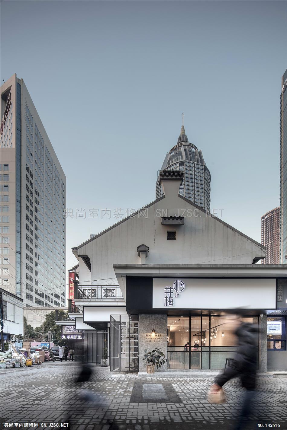
井梅酥面选址于江苏无锡市城区中心,周边面貌呈现出新老交替的特征,设计上以纯粹的基调作为出发点与喧杂的外部环境形成对比,让进入其中的顾客获得截然不同的感受。简洁的环境体验使顾客专注于食物本身,从而营造出食物与人对话的氛围。
The restaurant of Jing Mei Crisp Noodles is located at the center of urban area in Wuxi, Jiangsu Province, with the surroundings featured the transition from the old to the new. In the design, the basic concept of simplification as a starting point creates a sharp contrast with the clamorous environment all around, so as to give the custmer obviously different experience when entering the restaurant.The simplified interior design enables the customer to focus on the food itself, and thus creates the atmosphere of dialogue between the human and foods.
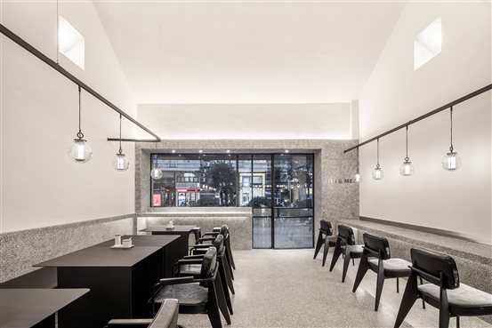
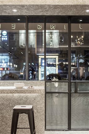
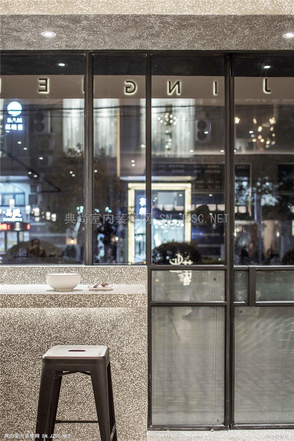
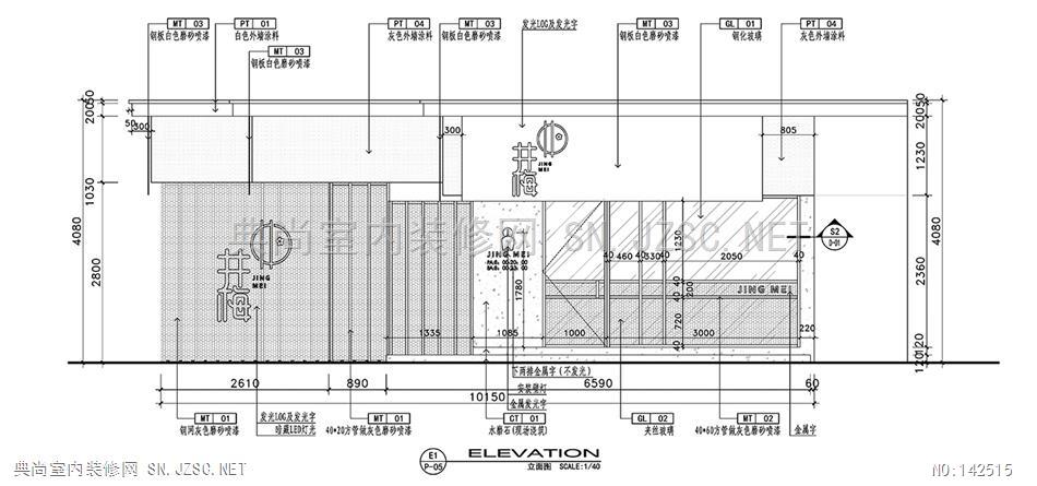
入口朝向城市街道,设计以体块感强化了界面,在视线可以互相穿透的同时保持内部的完整性。
The design of entrance that faces the urban street has highlighted the streetfront facade by its sense of mass, which enables an unobstructed view from both inside and outside, and meanwhile maintains an integrated interior.
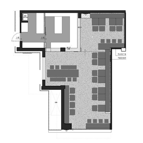

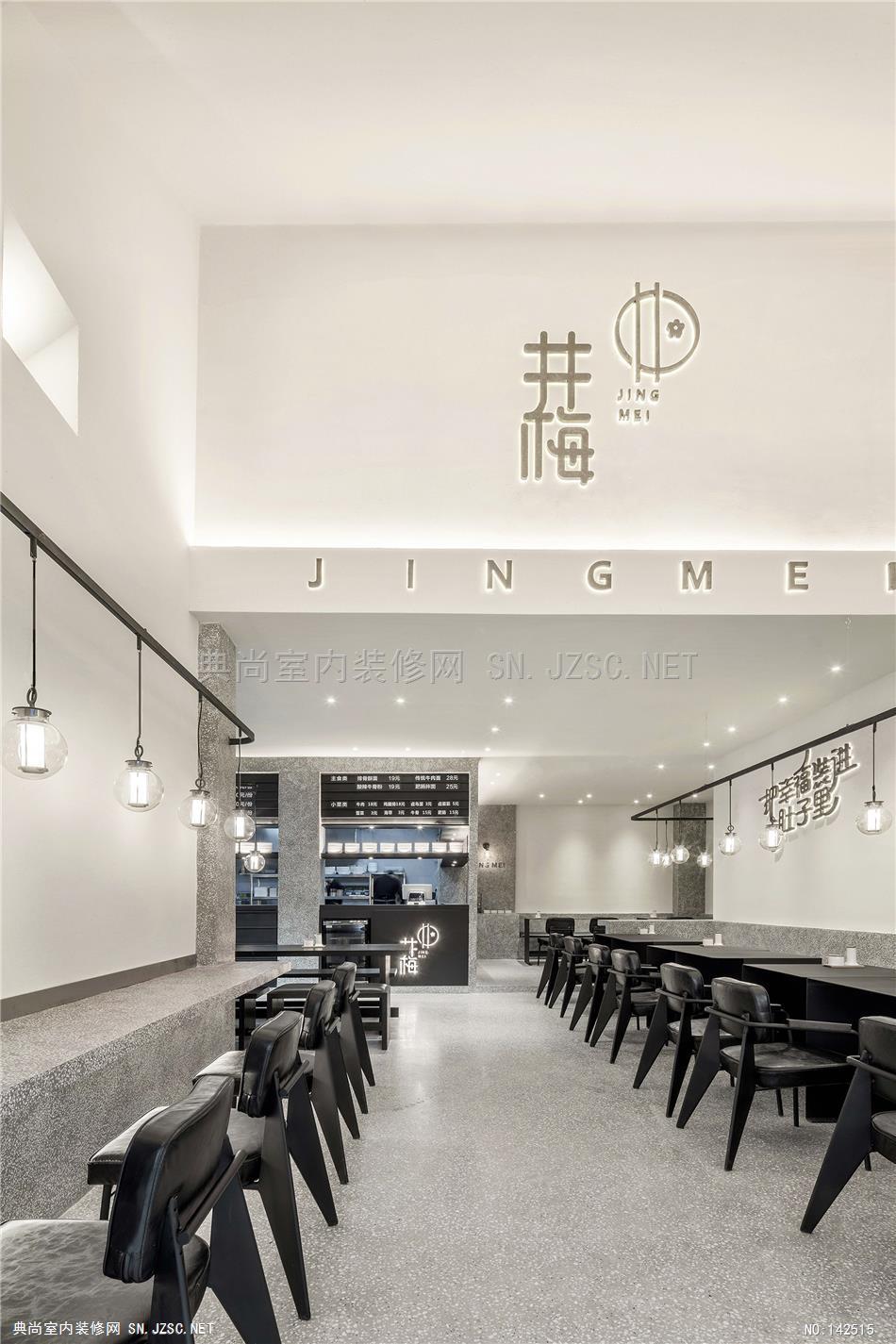
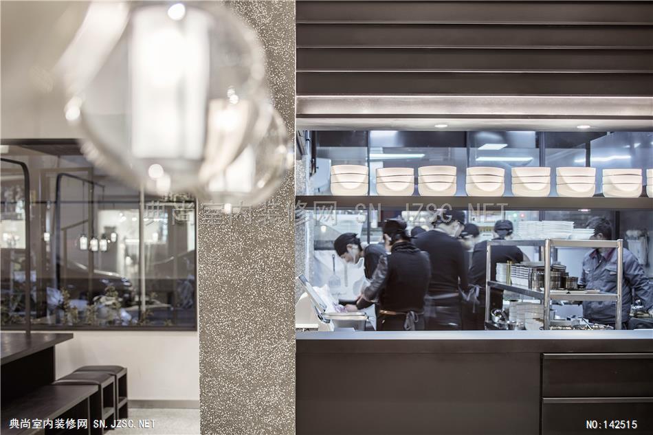
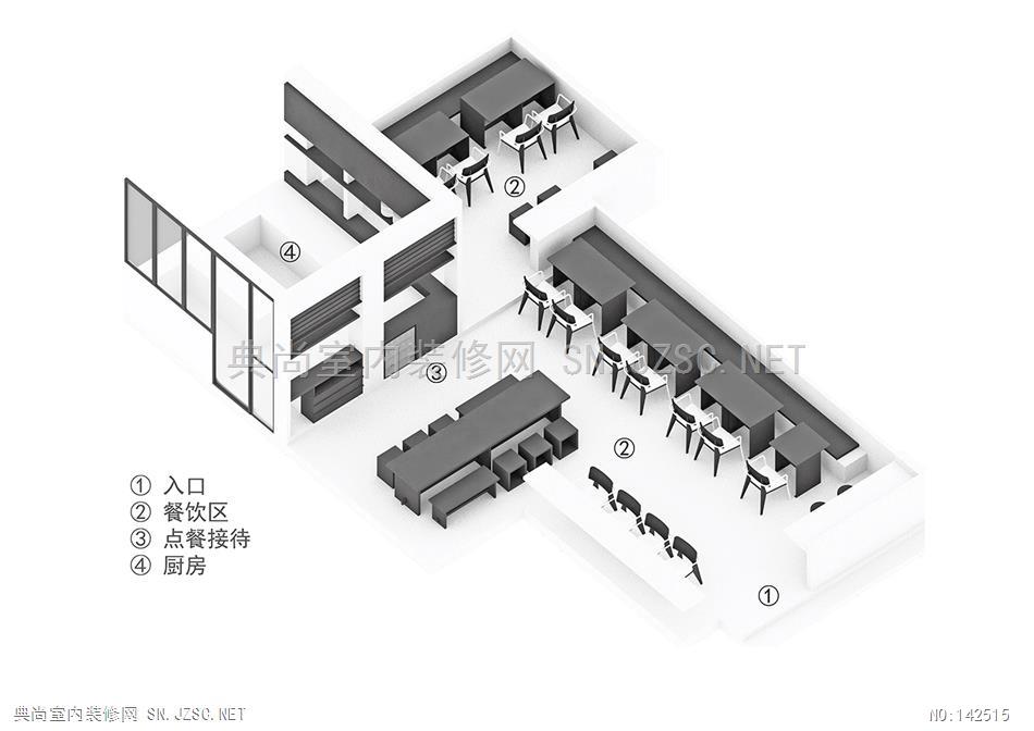
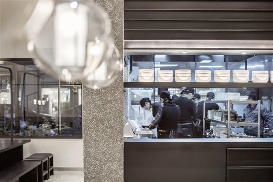
平面以开放性为主,将收银与明厨结合在了一起,入口的视线也刚好能看到收银区域与上方的菜单.
The layout of floor plan centers on the openness, combining the cashier desk with the open kitchen. Furthermore,
the cashier desk and the menu above it could be seen as soon as one enters the restaurant.
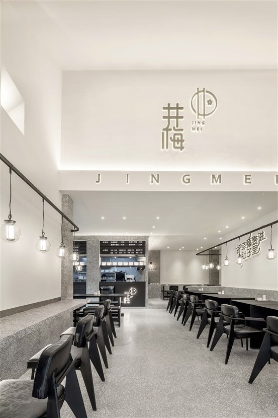

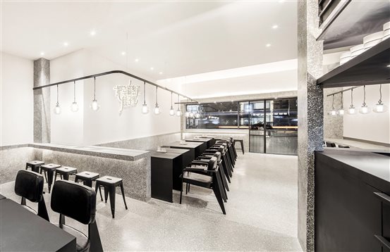
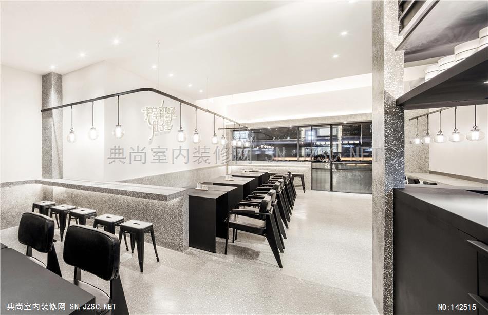
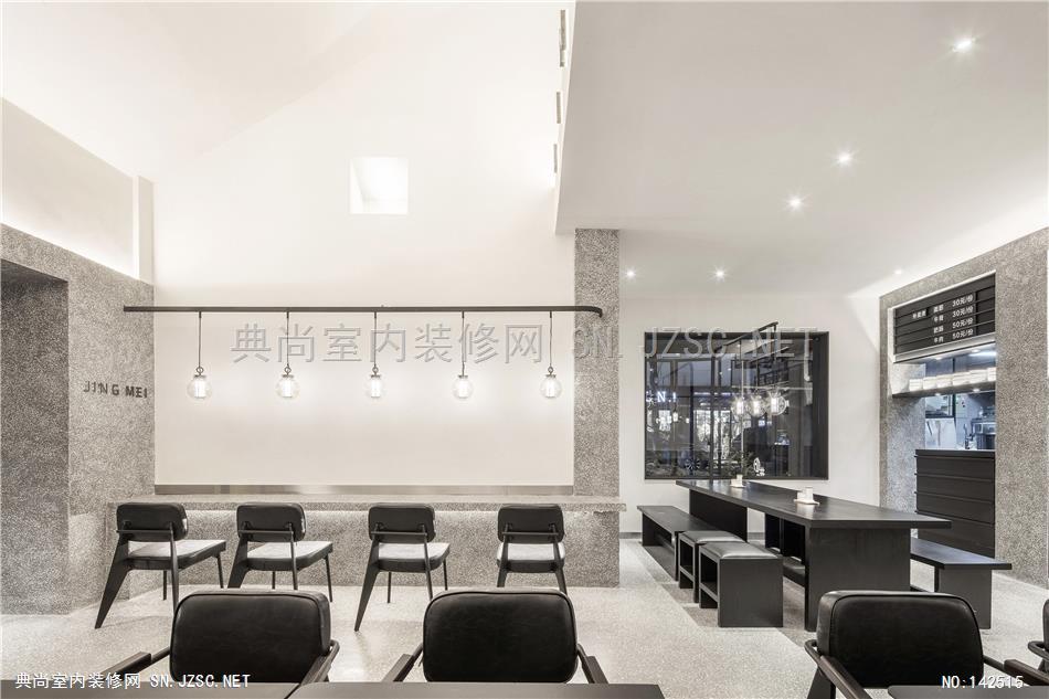
餐饮客座区利用了原本不规则的空间做了合理化区隔,对应不同人数的就餐需求。不同的功能区域通过设计结合为一个整体,排除了不必要的装饰。
The dining area has been logically divided based on the originally irregular space, corresponding to the various requirements of different numbers of customers.The different functional areas has been designed as an integral whole, without any unnecessary decoration.
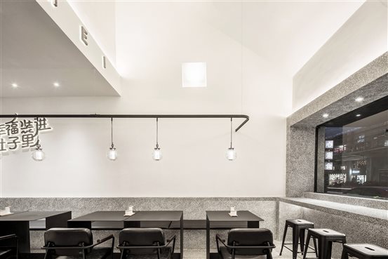

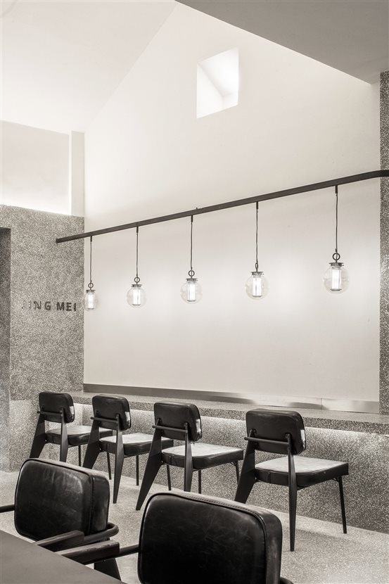
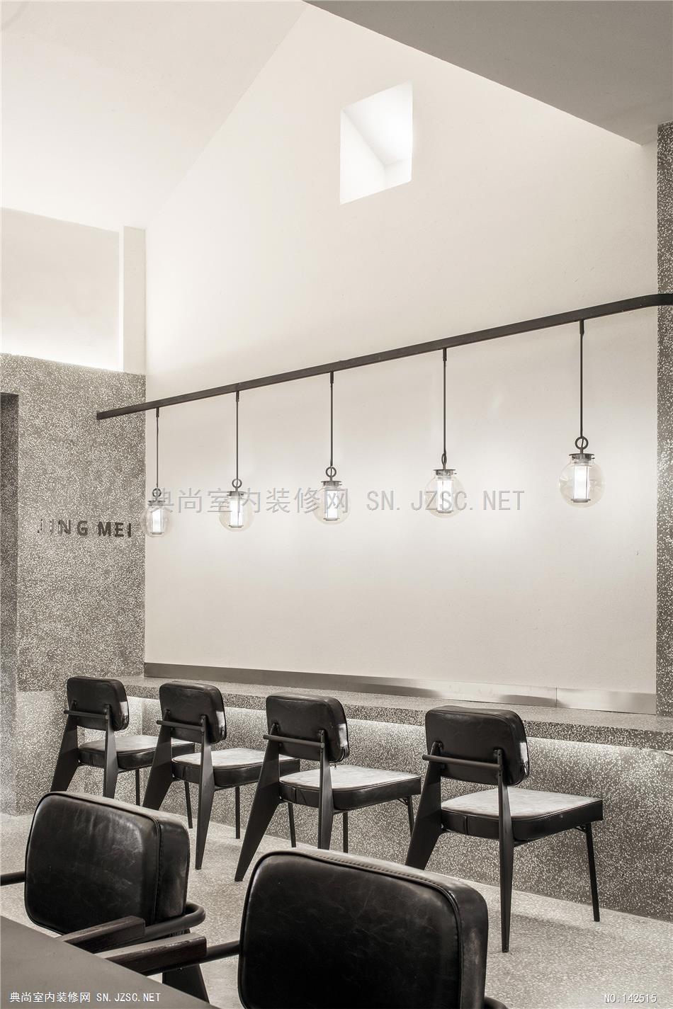
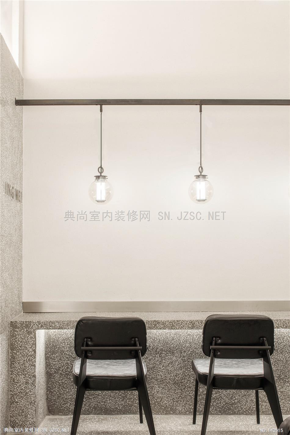
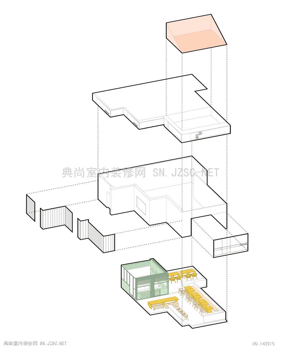
内部以黑白灰作为主色调,当中考虑了以材料特性作为空间质感呈现的一部分,白色硅藻泥墙顶面与灰色水磨石墙地面作为基础,辅以定制的黑色家具与吊灯。在建造过程中保留并改造了原有的局部坡顶,使空间层次更为立体。
In the interior design with the colors of black, white and grey as the dominant hues, the characteristics of materials are taken into account to be one of expressions of spatial quality. The white ceiling and wall of diatom ooze and the grey flooring of terrazzo are supplemented by the black furniture and pendant lamps. The existing partially pitched roof is maintained and reformed during the process of construction, creating an even more three-dimensional structure of the space.
