空间设计:水相设计
设计团队:李智翔,郭瑞文,张森贺
业 主:钜亨网
空间性质:金融出版办公室
座落位置:台北, 台湾
室内面积:820 m2
空间格局:接待大厅,会议室,茶水间,开放办公区,独立办公室
设计时间:2015.09~2015.11
施工时间:2015.11~2016.03
主要材料:大理石,竹皮,镀钛,铁件,地毯,皮革
摄 影:Sam Tsen 岑修贤
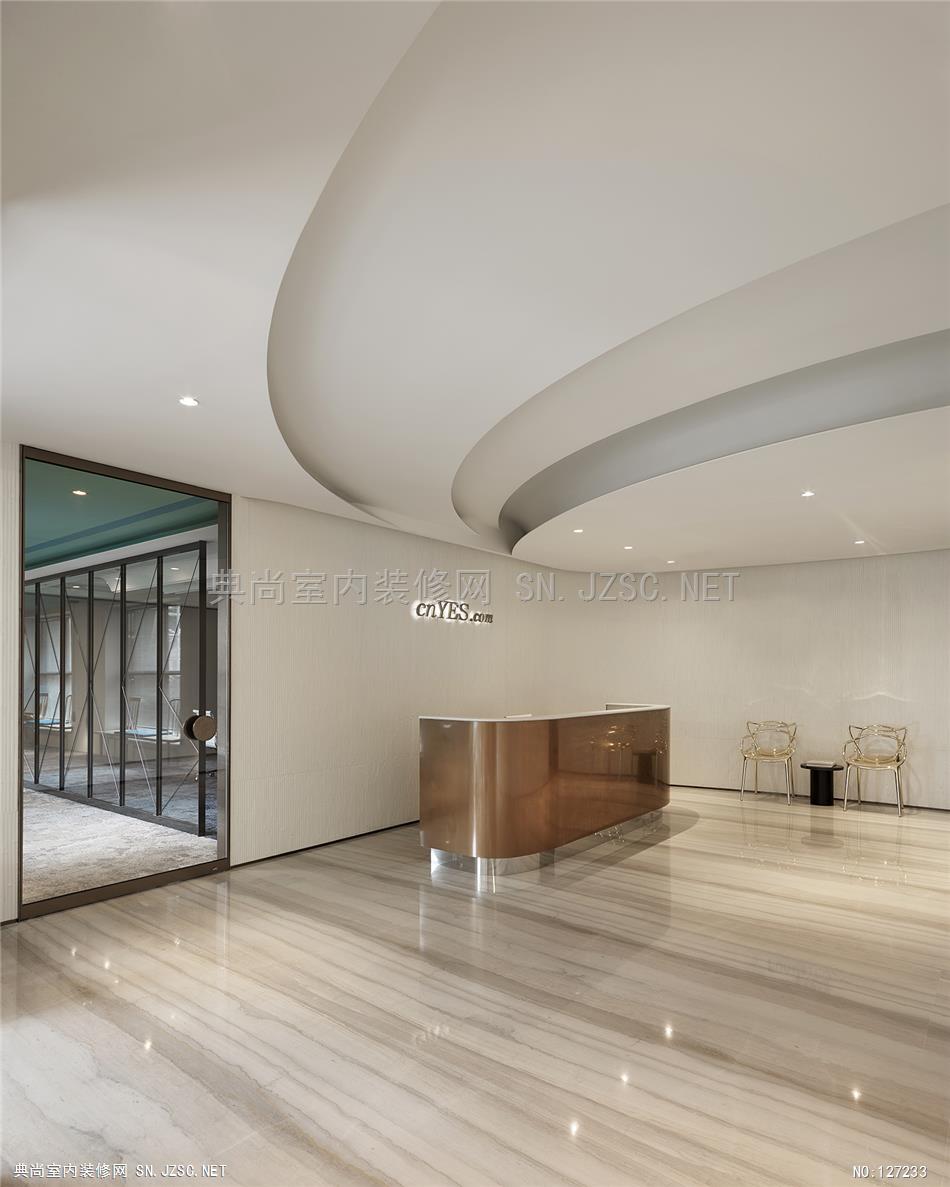
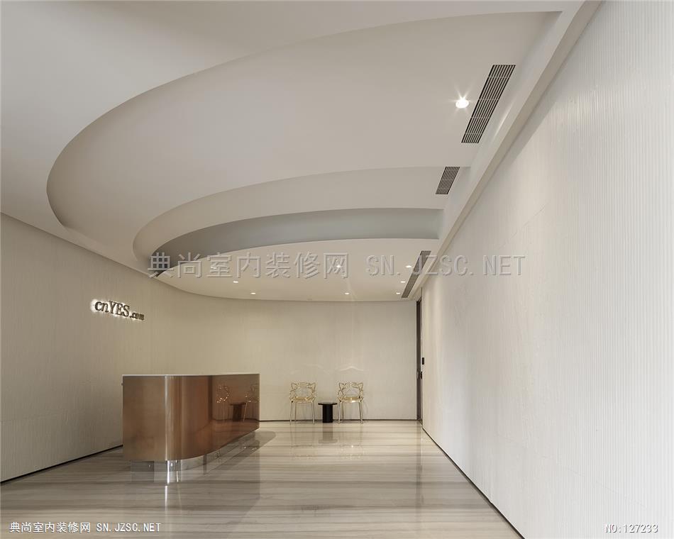
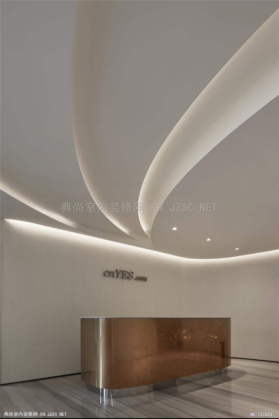
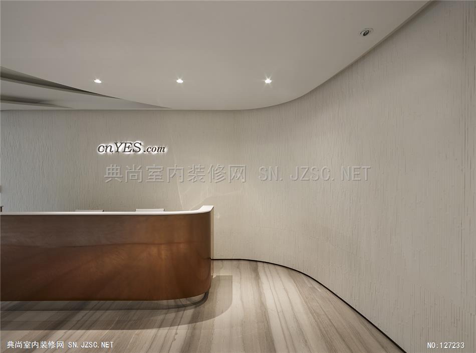
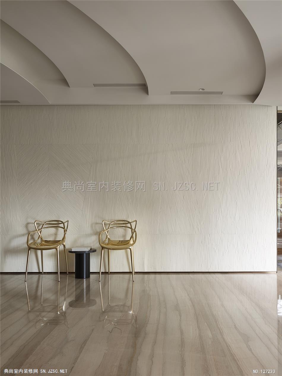
入门处即以金色接待前台与金黄纹理地面作为形象引导。使用象征财富的金色,呼应金融媒体钜巨亨网的特质。
钜亨网是一间结合金融与传播的财经网络媒体,兼备金融的稳健形象与媒体的创新特质,水相设计拣选「时间」元素为主导,在金融、货币与资金的迅速流动及网络即时消息的双重快速节奏下,调性仿如华尔街与硅谷的速度感。让时间在空间中解构,由节奏的快速流动与变化,创造同一时空中所蕴含之不同时间意义的空间。
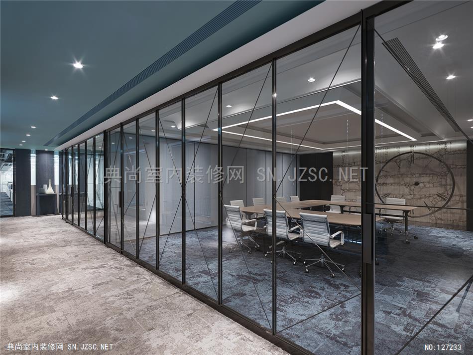
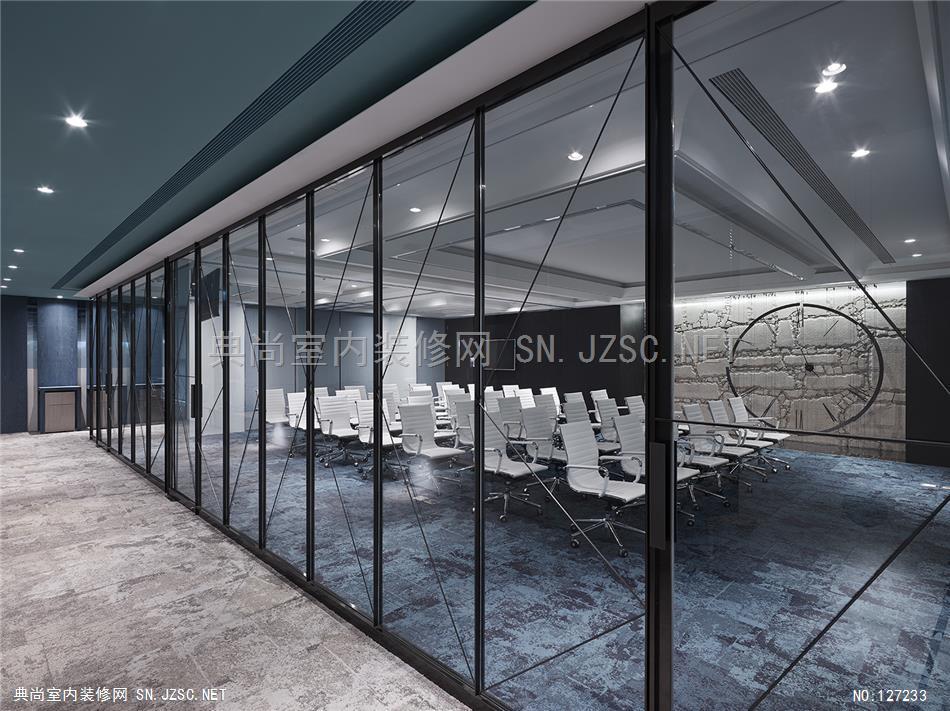
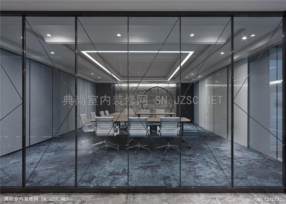
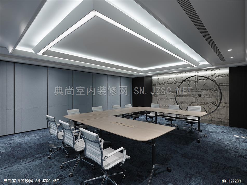
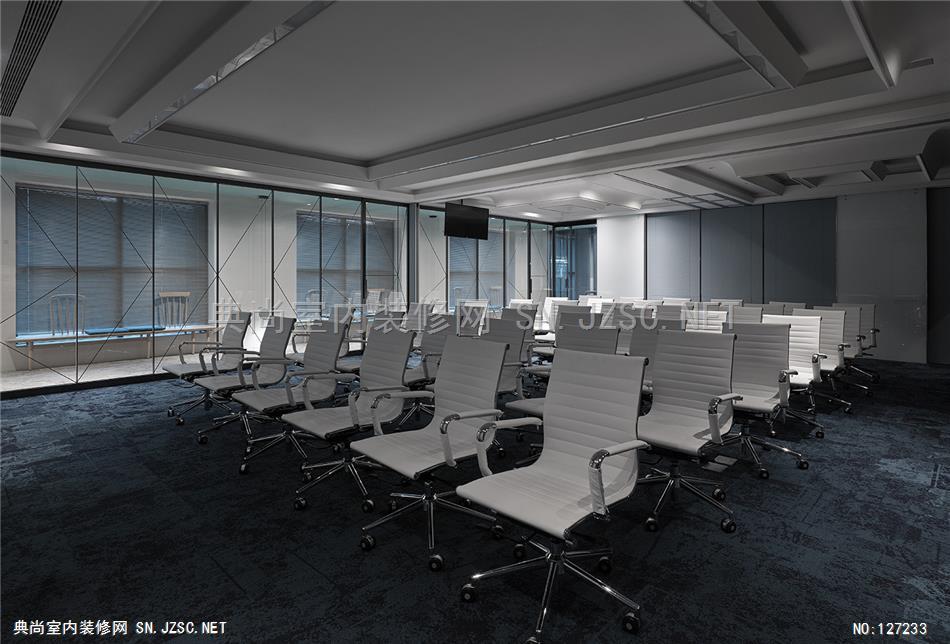
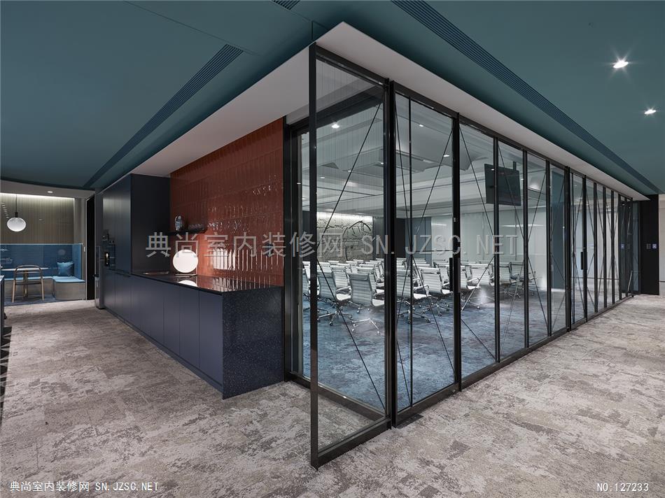
穿透性的铁件玻璃组成会议室的区隔,除营造出空间层次,亦丰富视觉的通透感,让空间和时间的
存在穿透界线。会议空间的规划使用活动式隔屏创造不同场地的转换,在墙体开合间转化不同尺度的空间量体,可自由变化小型会议室到百人视听室的不同容纳需求,创造更为善用的智能性空间。
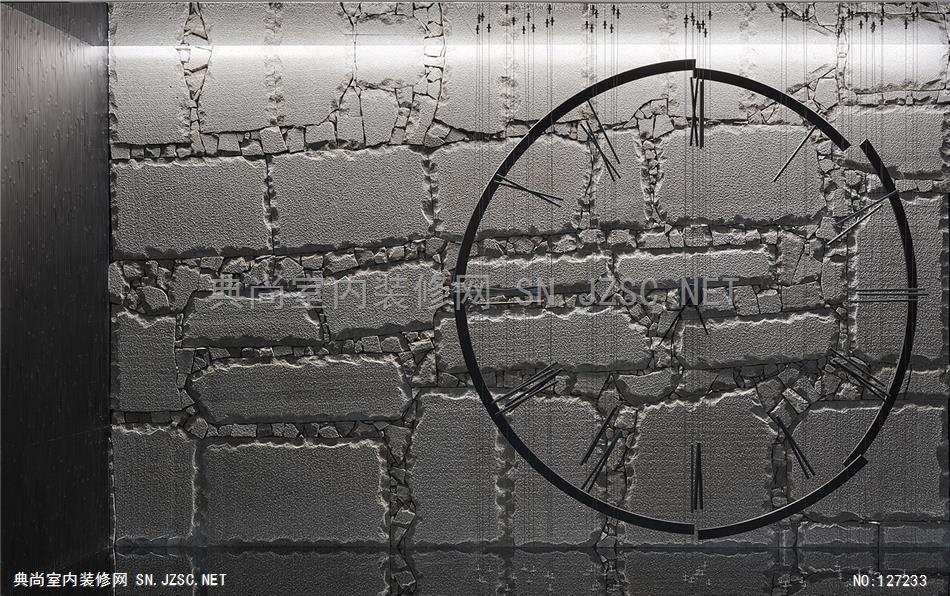
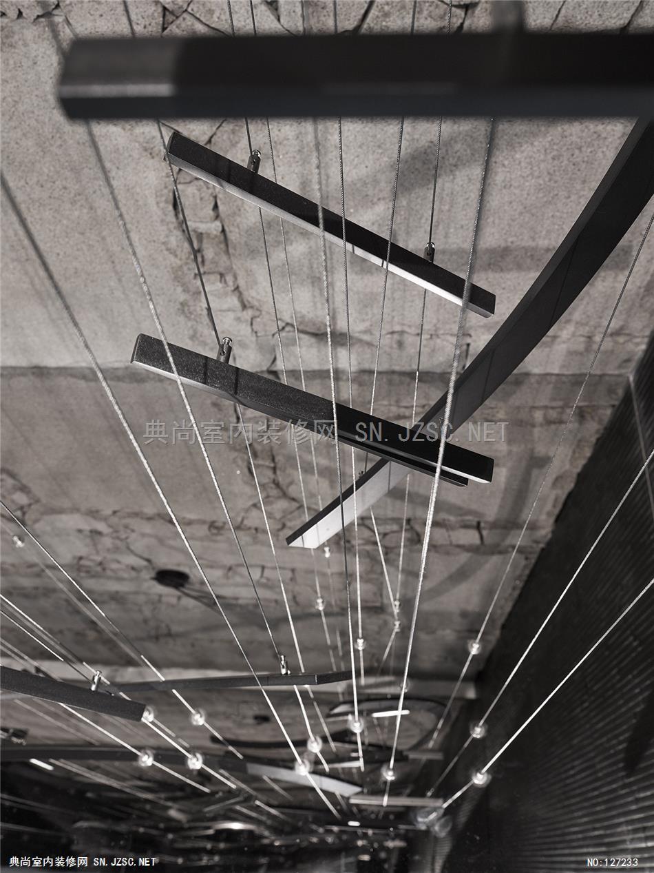
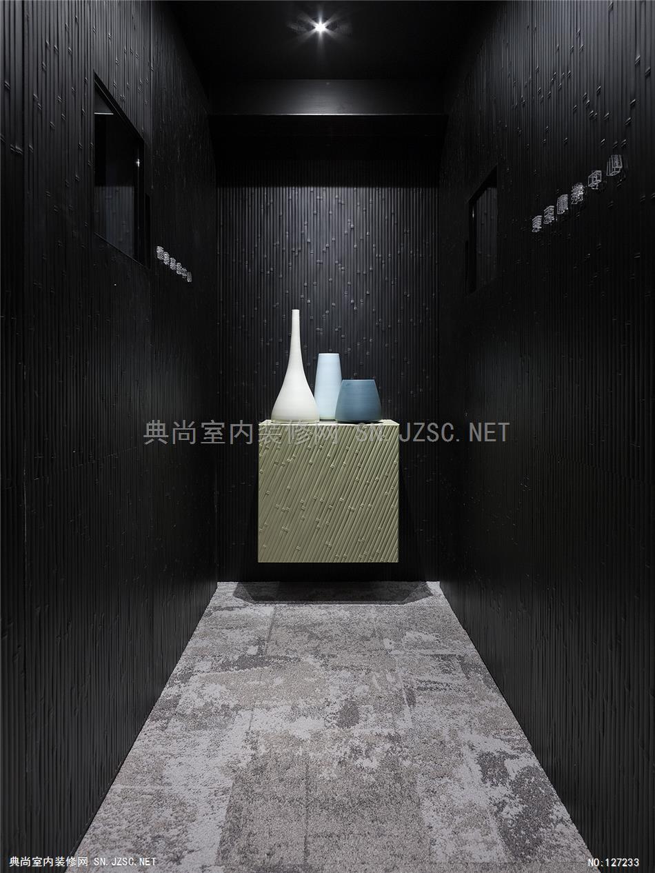
设计师藉由解构后的时钟片段,重新组合成一面看似散落却完整的抽象时钟,隐喻时间的递进与积聚,并萃取中世纪文艺复兴的纹理、石材,以及同时期绘制于宗教画作的珍贵蓝料元素,以含蓄的约略性质展现时间洗刷的累积过程。
"Time is Money",除映照出企业形象与宗旨,我们更将时钟解构重组,使用不锈钢材质搭配,创造工业时代经济快速发展的时间流动。背墙则以不经刻意的仿旧石材创造中世纪堡垒材质,结合古今元素,间接扣合起「时间」的主轴。
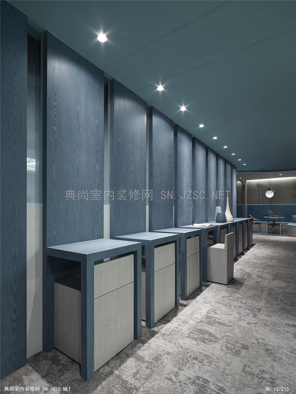
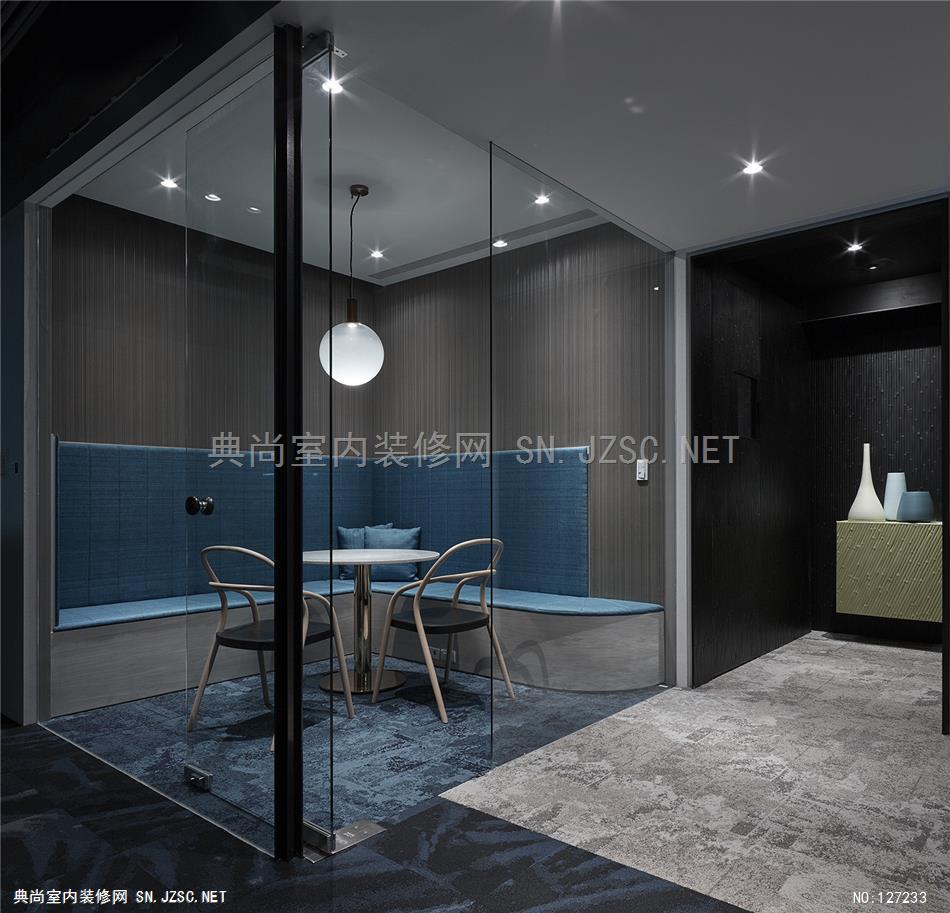
整体空间以金色及蓝色为视觉基调,呼应财富与威望、知识与信任的冀求,更于主廊道及茶水间设置木质开放式座椅提供阅读、讨论与休憩,让室内营造出流动性的时间暂留,在善用空间使用的同时,型塑一处可以供给每双追赶时间的脚步停下休憩之场域,让看似理性的时间加入空间的感受与体会,令时间因感性而激发转换不同以往的意涵。
设计师将茶水间桌椅与收纳柜相结合,让设计兼具实用与美观。活动式的拉椅下方提供杂物存放处,而长型的蓝色桌面则以欧洲中古世纪的长椅造型加以简化,呈现出「大椅包覆小椅」的趣味意象。
cnYES Office
Taipei, Taiwan
FIRM
Waterfrom Design
TYPE
Commercial ? Office
STATUS
Built
YEAR
2016
SIZE
5000 sqft - 10,000 sqft
Design: Waterfrom Design co. Ltd.
Designer: Nic Lee,Sam Chung, Richard Kuo
Client: cnYES Office
Category: Financial Publishing Office
Location: Taipei, Taiwan
Floor Area: 820m2
Layout: Reception Area, Meeting Room ,Pantry, Open-plan Office, Independent Office
Material: Marble, Bamboo, Stainless, Carpet, Leather
Design Period: Sep. - Nov. 2015
Construction Period: Nov. 2015 - Mar. 2016
Photographer: Sam Tsen
Integrating finance and mass communication to provide financial website services, cnYES is an internet media company characterized by stability images of financial business and innovation features of the media. To highlight the sense of speed as in Wall Street and Silicon Valley, Waterfrom Design selects the element of “time” as the theme complemented by the dual fast pace of swift financial, monetary and cash flow as well as online real time information. Time is to be deconstructed in the space while in unison the space is to be reinvented and interpreted with different time definition through rapidly floating and changing rhythm.
The designer then reassembled deconstructed fragments of a timepiece to create a seemingly scattered yet complete abstract clock, implicating progressiveness and cumulativeness of time, followed by extraction of the stony texture dated back to the Renaissance in the Middle Ages as well as elements of the then precious blue pigments used in religious paintings to unfold the accumulation process of time clearing-up in an implicit and approximate manner. Gold and blue are picked as the visual keynote to represent the aspiration for wealth and prestige along with knowledge and trust. Wooden freestyle seatings are provided in corridor and lounge room for cozy reading, discussion and relaxation, setting an atmosphere of floating persistence of time in the office. In line with the wise use of space, places for rest and refreshment are created and offered to ease the hustle and bustle. With the addition of feeling and appreciation of space, the seemingly rational time is inspired to take on a new meaning unlike before.
The conference area is segmented with see-through steel parts and glass, creating space hierarchy and enriching visual translucency to remove the demarcation separating space and time. The change of conference area from a small room that seats several participants to a big auditorium that accommodates a hundred participants is made possible thanks to movable partition panels, allowing for a better and more intelligent use of space.
