VISIT OUR SHOWROOM—
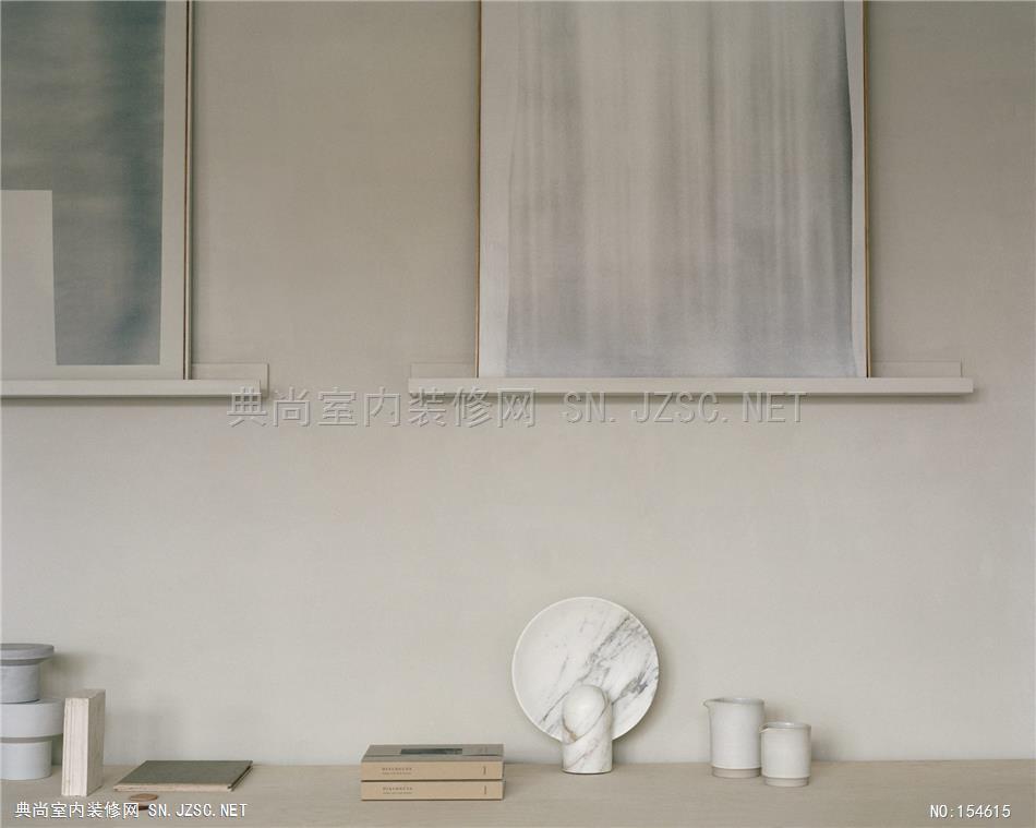
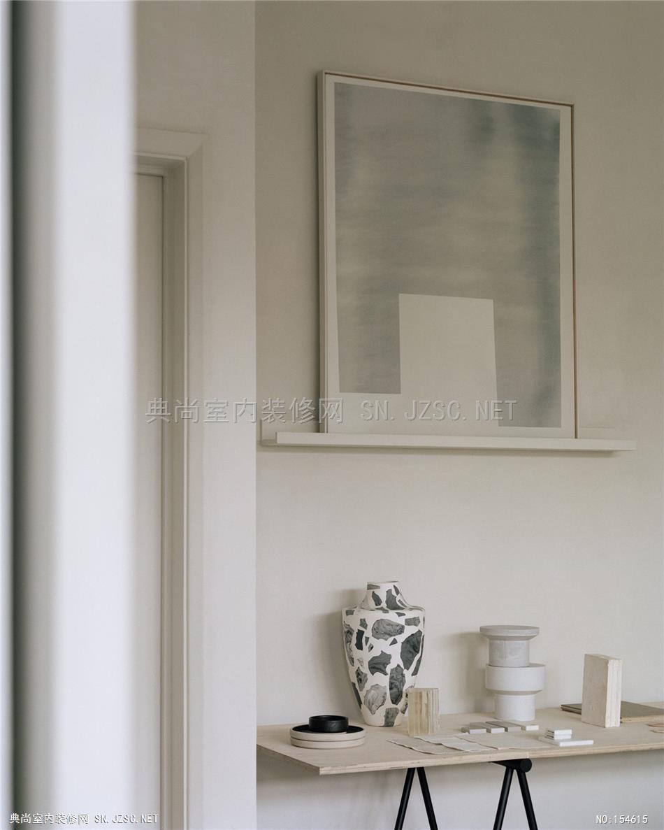
An edited collection of paints, furniture, objects and accessories that are chosen for their inherent life-balancing qualities
RG1148c_06.jpg
NOURISHING SPACES
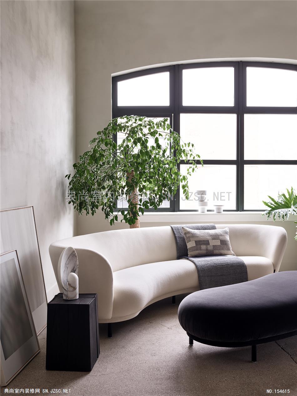
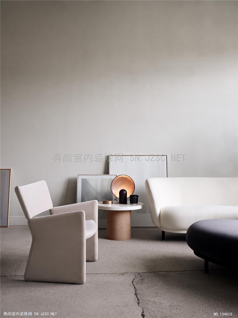
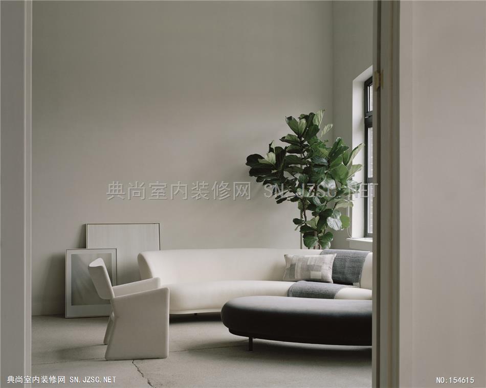
We have created a sensory space in our North London studio, for our clients and collaborators to see, feel and experience how we live our design principles each day. We believe simplicity, calm and warmth can be energising, motivating and nurturing in a workspace, so we have put this into practice at our new studio and showroom. All items including paint, product and plants are available through House of Grey.
By appointment only–please contact us to book.
Cereal | House Of Grey
Cereal Magazine Volume 17. Finding Meaning in Design. It was such a pleasure to shoot this story on a good friend of mine, Louisa Grey from House of Grey. Words: Lucy Brook
A creative studio's serene north London space
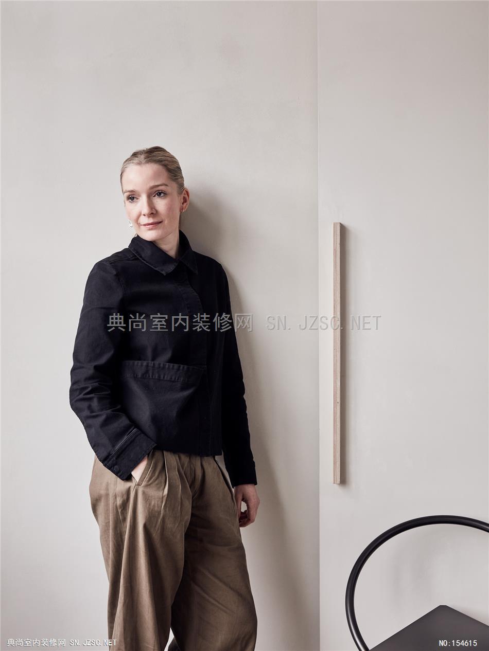
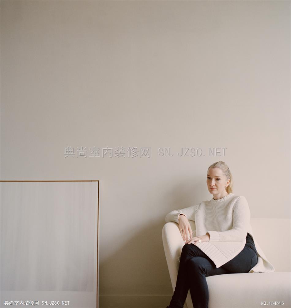
Archway isn’t a part of London that is teeming with design studios, but that’s part of the charm that appeals to stylist and designer Louisa Grey. Her new workspace, showroom and creative studio reside in an adapted Victorian saw mill just off Upper Holloway Road, and the gaping industrial spaces have been given the full House of Grey treatment. Anyone who ventured to Finsbury Park last September for In The Neighbourhood – an introduction to Grey’s new immersive design retail business via a shoppable exhibition of furniture, lighting and objet in her own home – will be familiar with the affect: calm, composed and soulful.
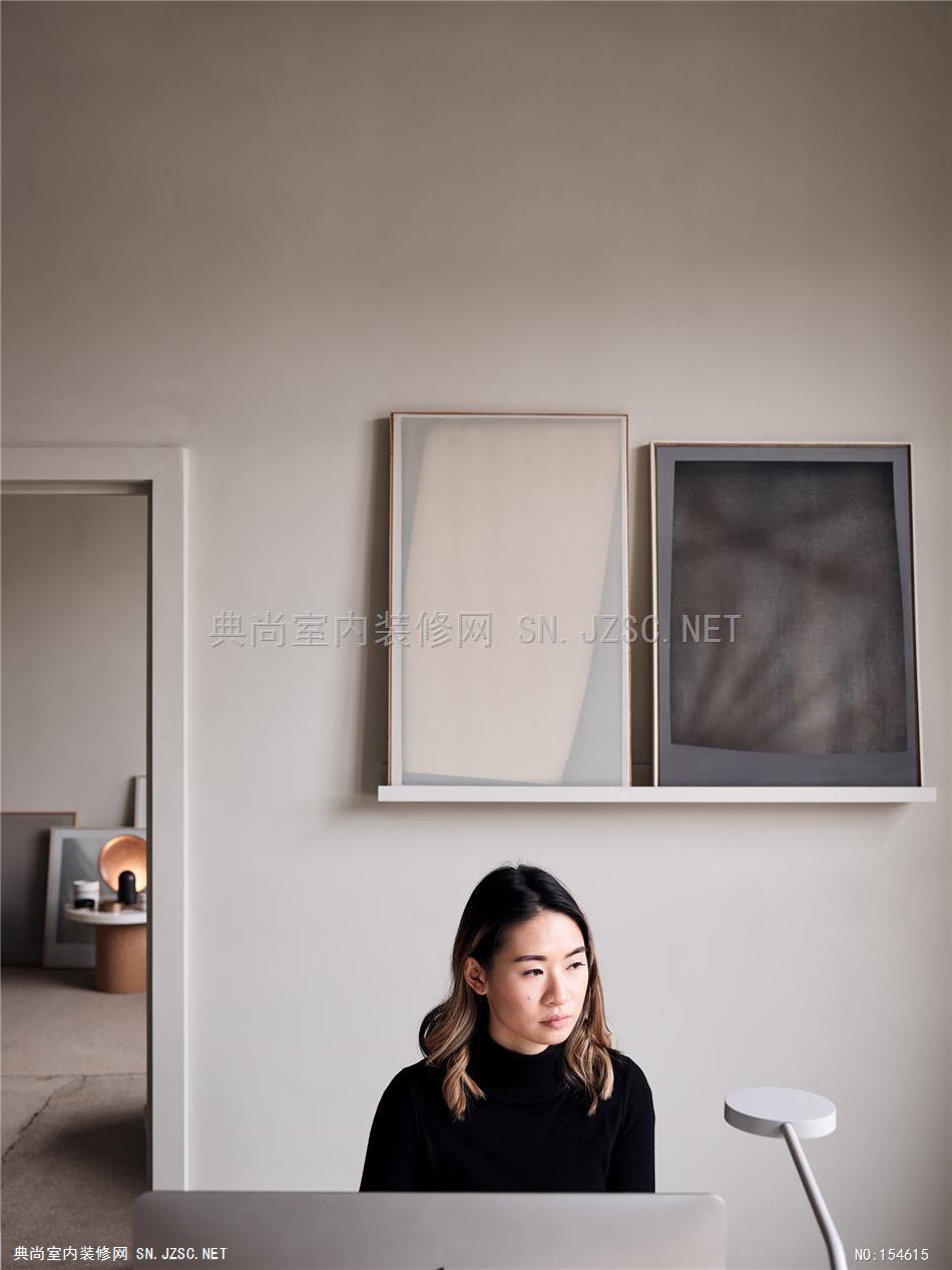
For the new House of Grey HQ, comprised of a series of four spaces – an office, showroom and two photographic studios spread over the first floor of the converted warehouse – Grey wanted to achieve something that went beyond a pleasing aesthetic. “It feels quite meaningless when you just make a space look beautiful because that’s what you like, without any real thought behind the emotional impact on a person. To me, that dates,” she says. “We wanted to incorporate our own design philosophy but also really consider how the design impacts our team’s health and wellbeing. We wanted a calming environment, combining natural materials and limiting the pollutants for a positive and productive workspace.”
It feels quite meaningless when you make a space look beautiful because that’s what you like, without any real thought for the emotional impact on people. To me, that dates.
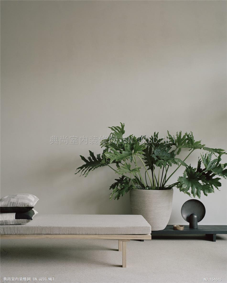
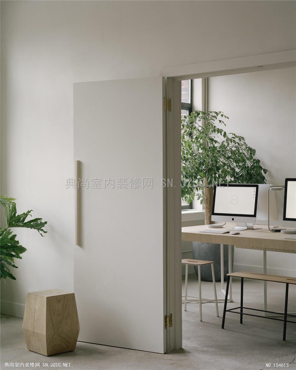
The House of Grey team worked with consultants Ekkist, who helped imbue the multi-functional space with a set of wellness design principles to do with colour, light, materials, scent and avoiding harmful toxins. Ekkist specified an Italian paint called Airlite, which has no VOCs and is touted to reduce pollutants, mould and bacteria from the atmosphere by 88%. “The company painted the inside of a road tunnel with it, a place in Italy known to be highly polluted, and took measurements over the course of 10 years. It reduced the problem significantly,” says Grey, who chose a pale, greenish white for the walls. Likewise the floors have been stripped back and treated with a natural lacquer followed by non-toxic wax from Eco Pro Tec for a matte effect. To help purify the air further, Ekkist also suggested particular plants and trees that were sourced locally in Crouch End from Urban Flowers Co.
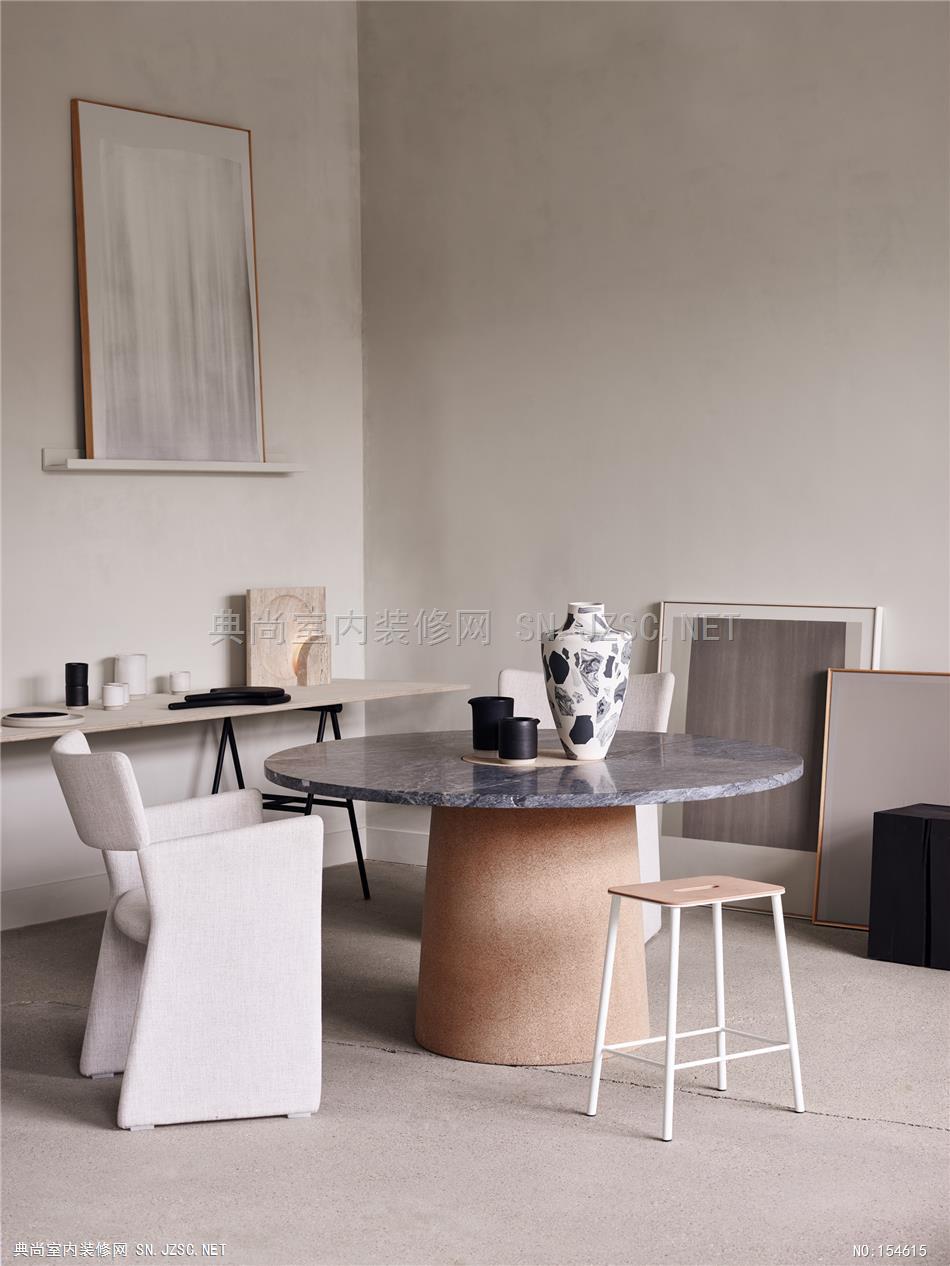
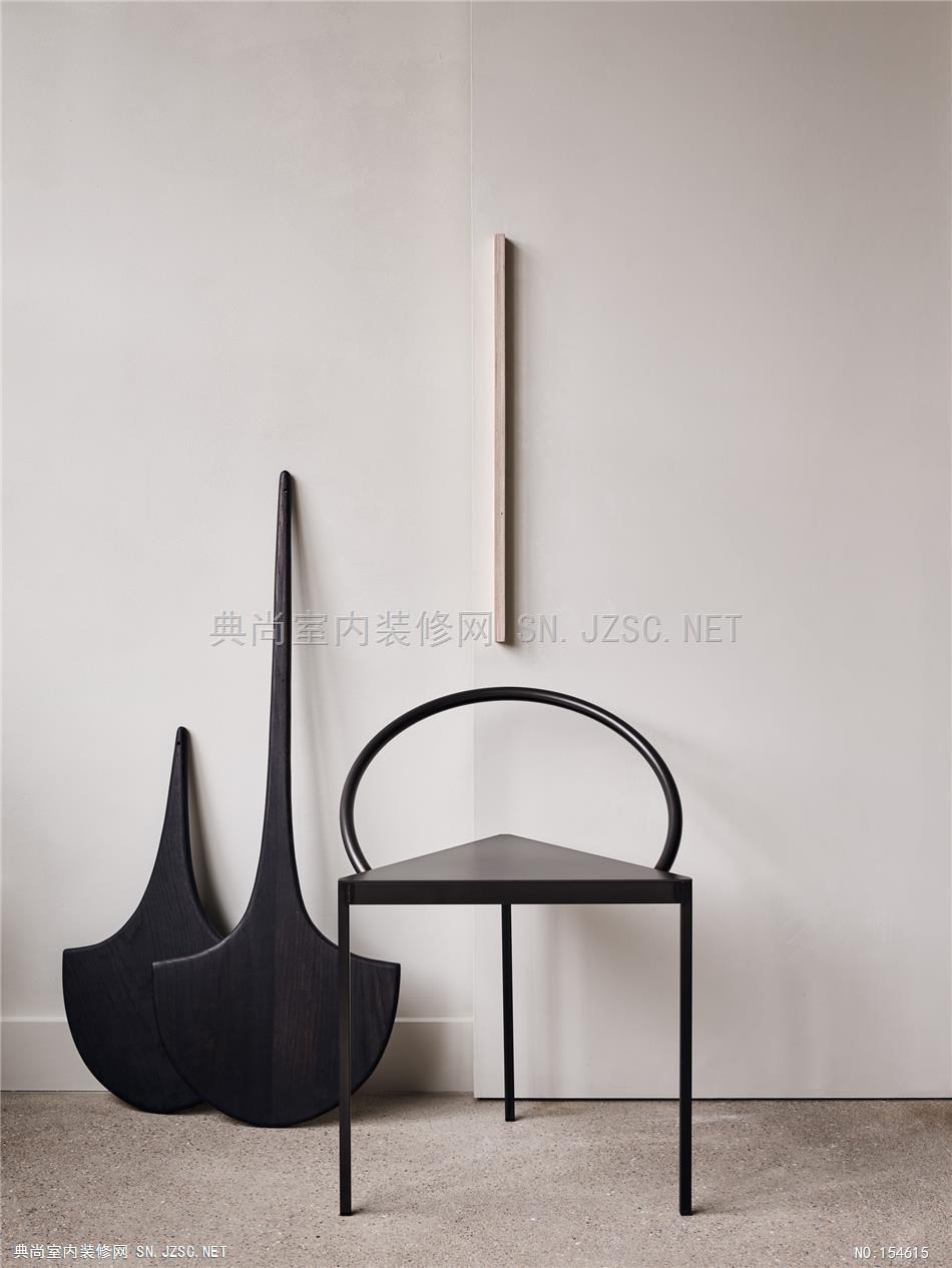
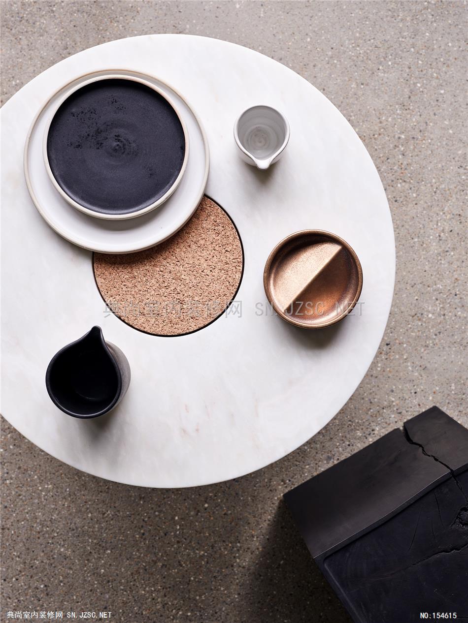
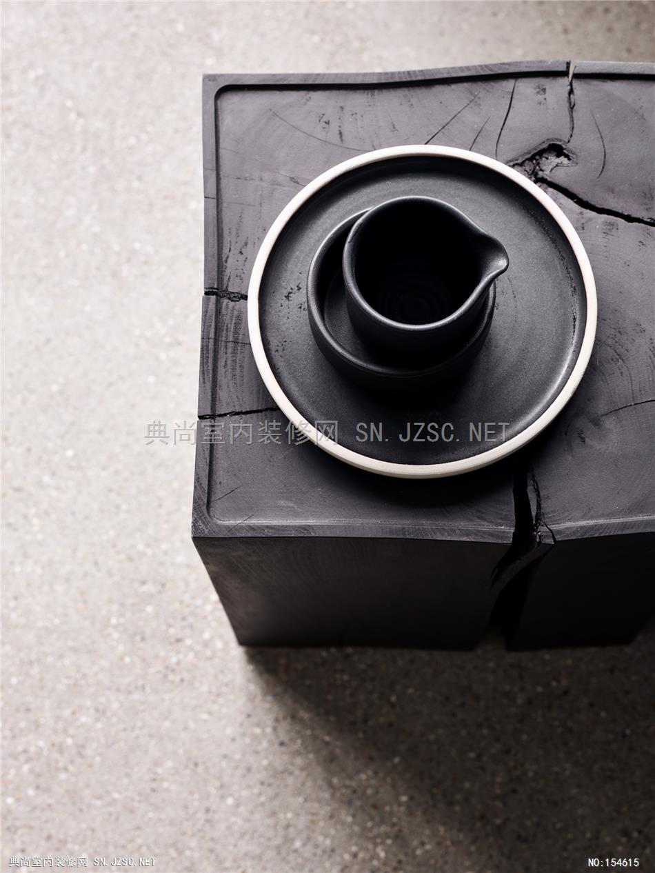
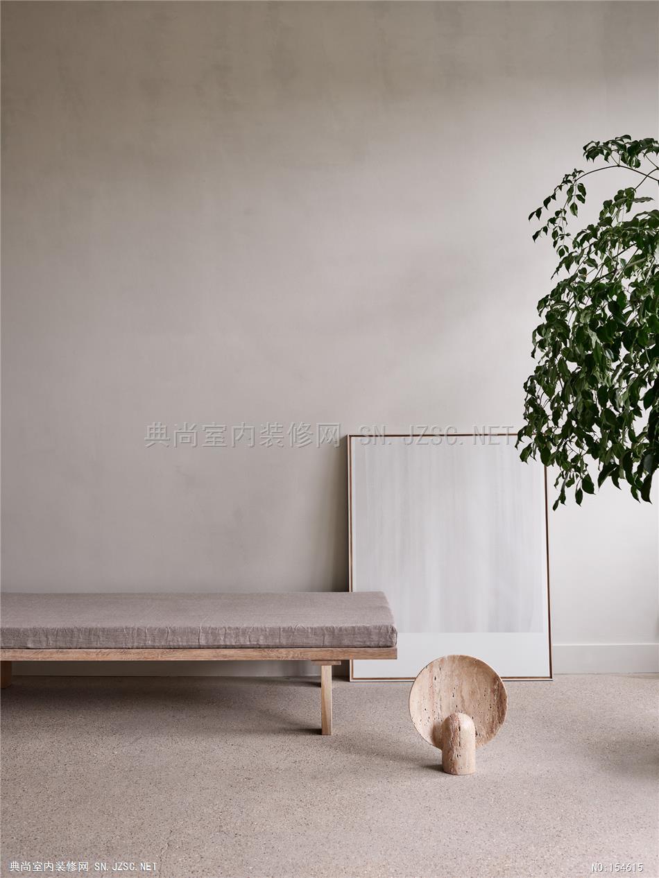
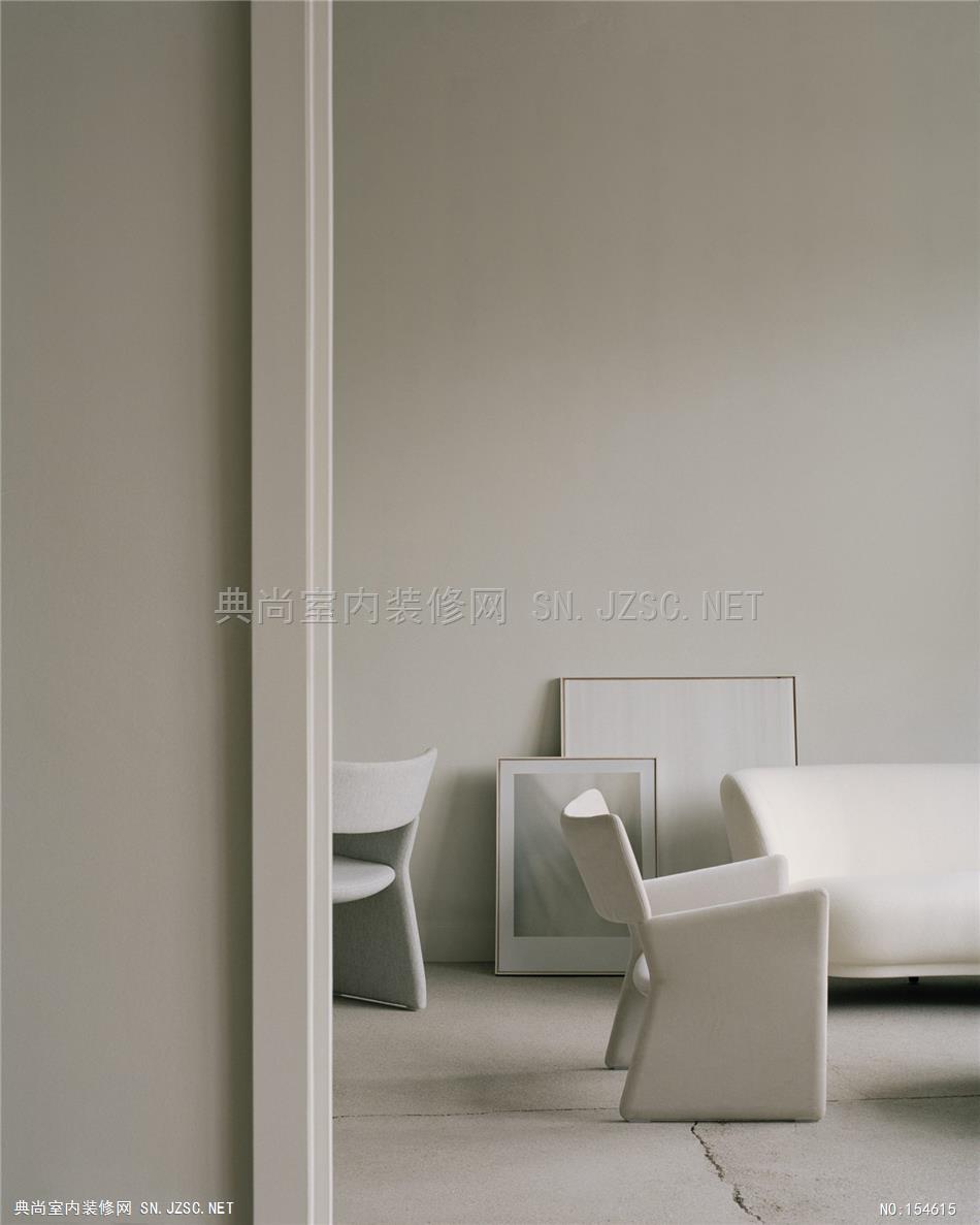
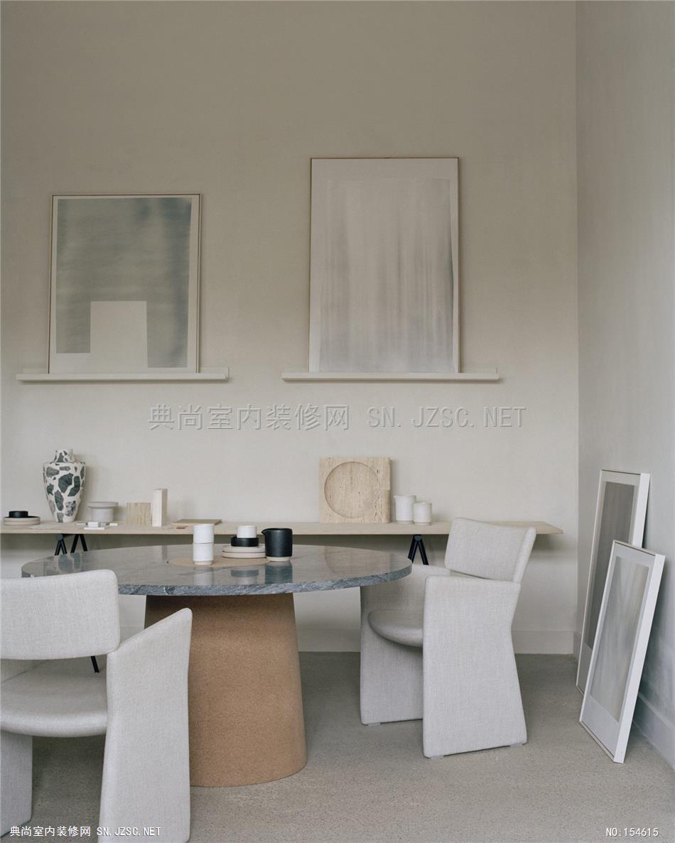
The showroom is the place guests are brought into first – with its curated collection of furniture and lighting by the likes of Frama and Henry Wilson as well as London-based talent such as abstract artist Tycjan Knut, designers Natascha Madeiski and Phil Cuttance, wood master Edward Collinson and the work of handmade textile house, Stitch by Stitch. “We call the showroom ‘the apartment’ because it’s so comfortable – it’s like home. It’s also a place we can sit and have lunch together, to get away from our desks. This is one of the wellness principles we’ve applied to the studio.” says Grey. “When clients come in here they say, ‘I want my house to feel like this’. That’s an achievement, I think.”
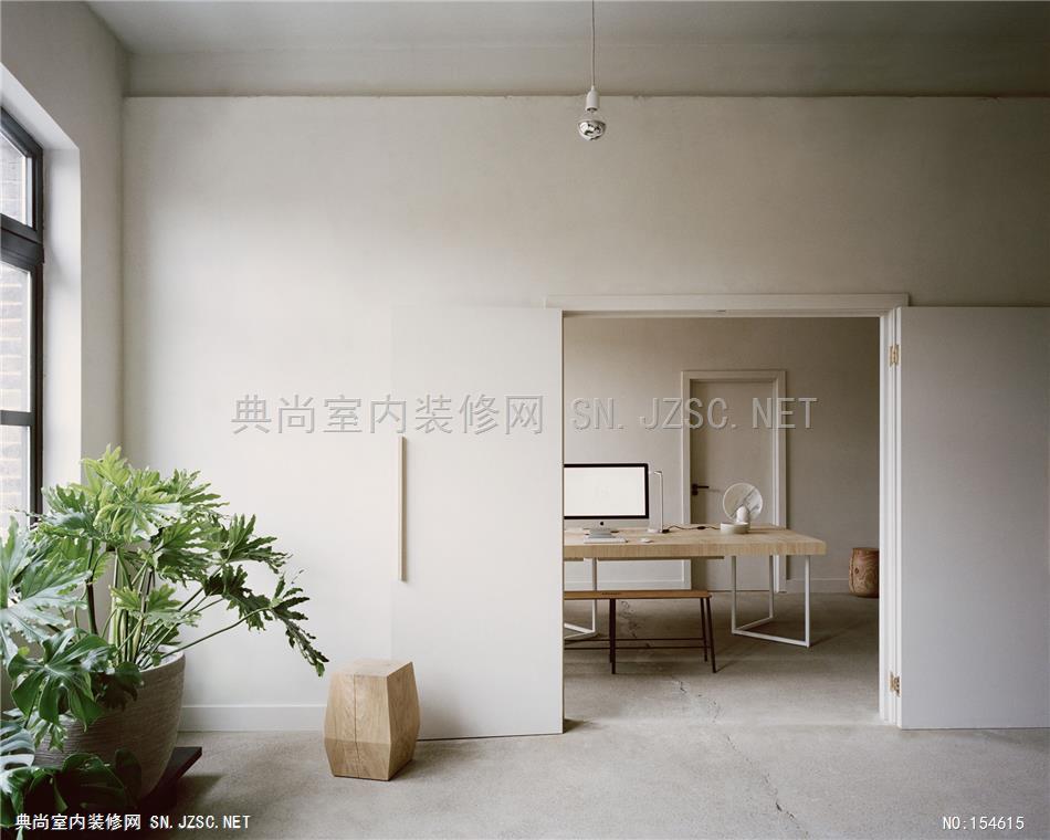
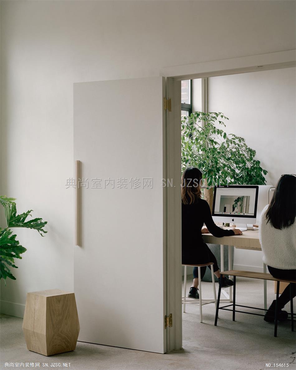
Through discreet double doors is a simple, light-filled workspace with a bespoke timber-topped table and metal base, Frama stools, several plants and not much else. “We wanted to show people that a workspace doesn’t have to be a sterile environment with lots of fluorescent lighting if you consider it and put time into it,” Grey says.
Flanking either side of the office and showroom are two multi-purpose spaces – called Archway Depot – that can be rented for photoshoots and events, and will be used for weekly yoga sessions for the team. The larger studio is almost 300sqm, including a full kitchen, and the smaller studio is around 70sqm. (Outside of the retail business and House of Grey, Archway Depot is a joint venture with Grey’s longtime collaborators, Clare and Richard Proctor.)
“We only just moved in but it’s already been so good for us,” says Grey. “This move toward wellness started with me being stressed out in life and thinking about what made the home environment so much more calming. It started small with a few simple things but it has become something bigger for us.”
